

Overview
The Theme is a style applied to every component of CometChat. When a style is applied as a theme, every view in the activity or every component in the UiKit will apply each property of the theme that it supports. CometChat theme comprises two key components: Palette and Typography. Palette: The Palette is a singleton class that possesses all the color variables with their default values. It can be used to customize the color scheme of the CometChat theme, including background color, primary and secondary colors, error color, and various levels of accent colors. Typography: Typography, which is also a singleton class, encompasses all the default Text Style’s values. It allows you to customize the text appearances throughout the CometChat theme, such as heading, name, titles, subtitles, text, and captions. sUsage
Palette
The CometChat UI kit provides an easy way to customize the visual appearance of your chat application via the Palette class. This class contains several methods that allow you to modify the default color scheme of your app, imparting a unique look and feel that aligns with your branding or design guidelines. Here’s an overview of the different methods available in the Palette class:
Example
To match the theme of your app you will need to set primary , secondary and accent color using Pallate.
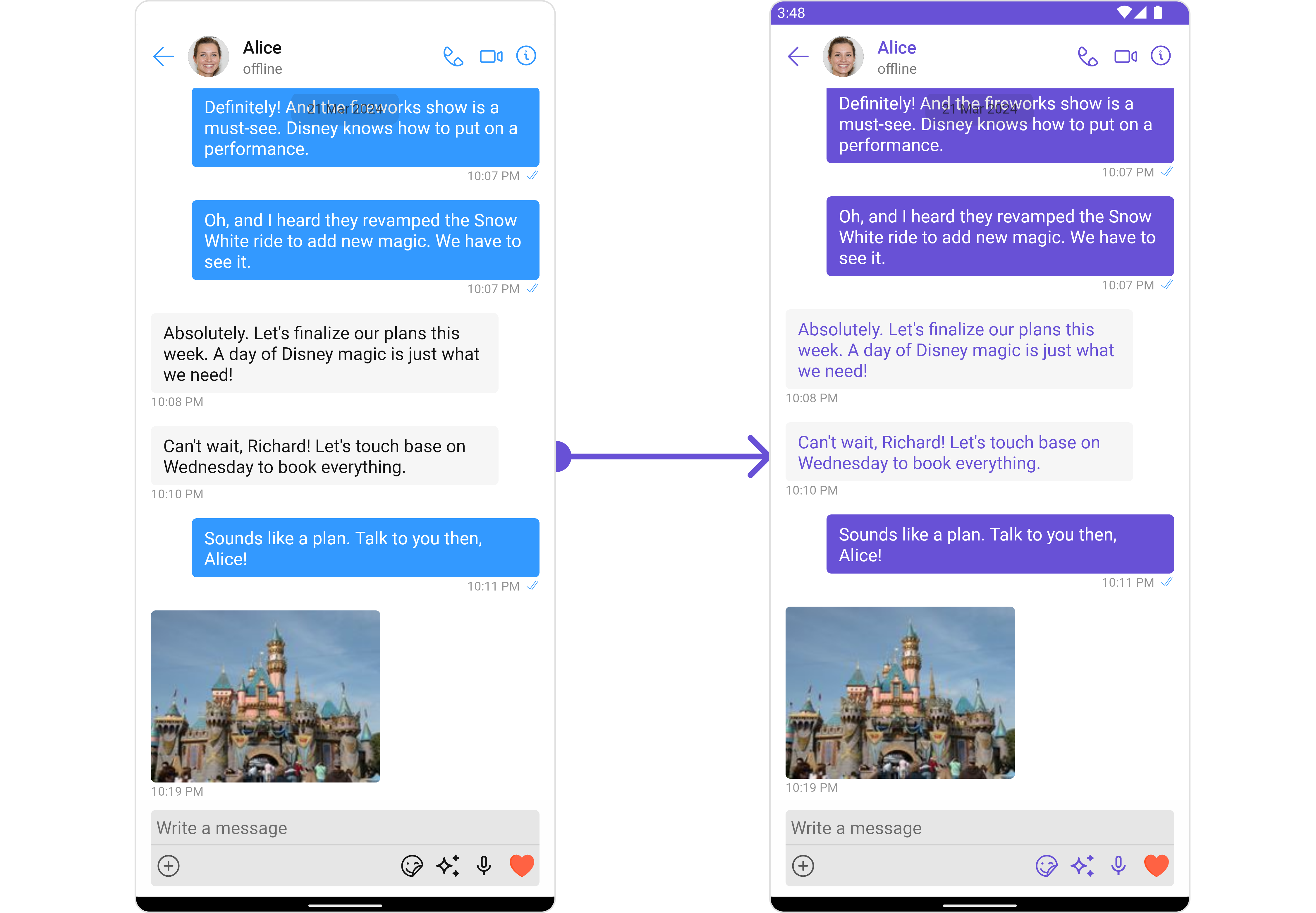
- Java
- Kotlin
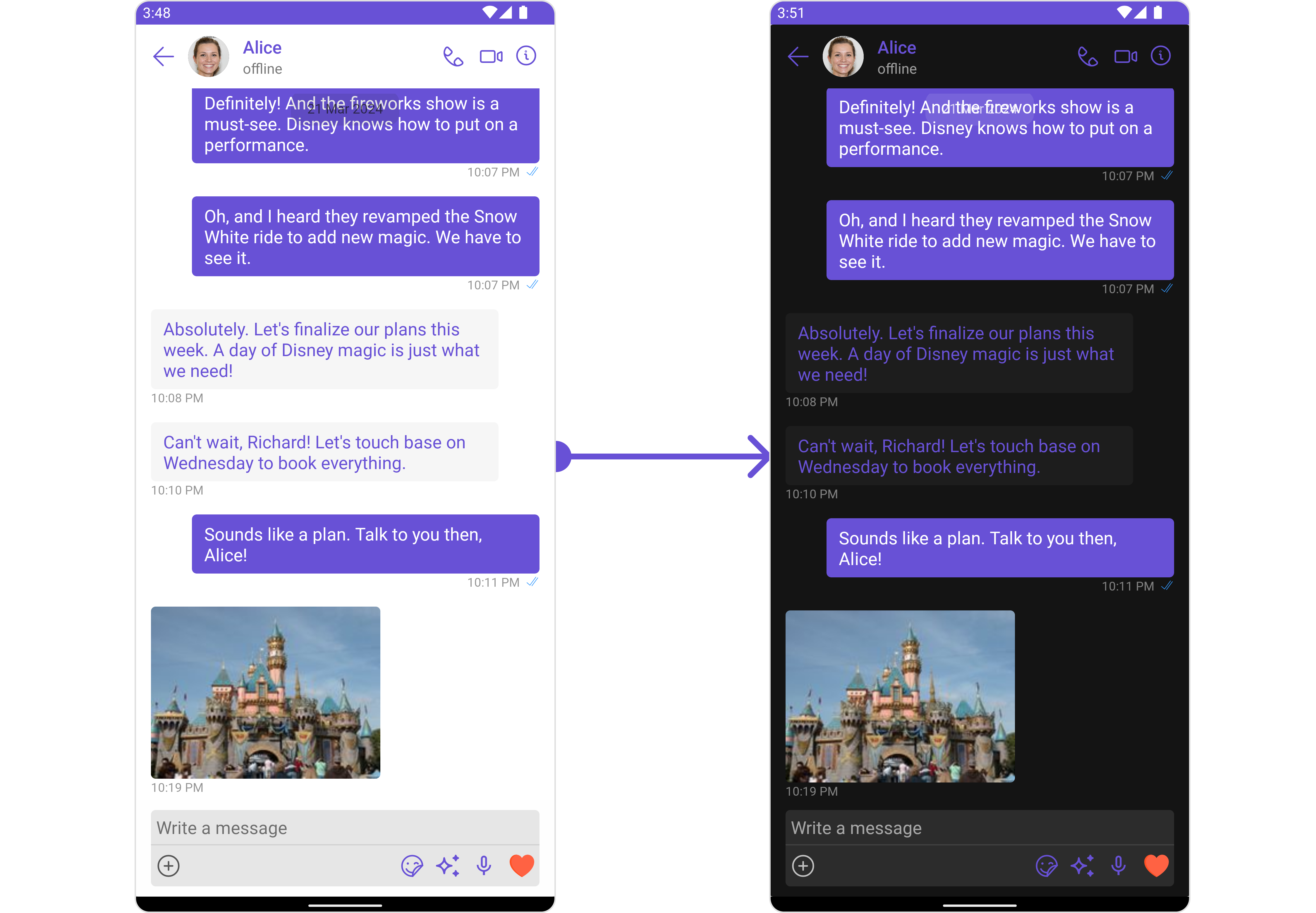
- Java
- Kotlin
Typography
The Typography class provides methods that allow you to change the default text styles in the CometChat theme as per your requirements. Here are some of the methods provided by the Typography class:
To change Name TextStyle of the UiKit Theme Please refer to the code below :
- Java
- Kotlin
similarly to change other Text Style of Theme you can refer to the above mentioned method.