AI Agent Component Spec
AI Agent Component Spec
Overview
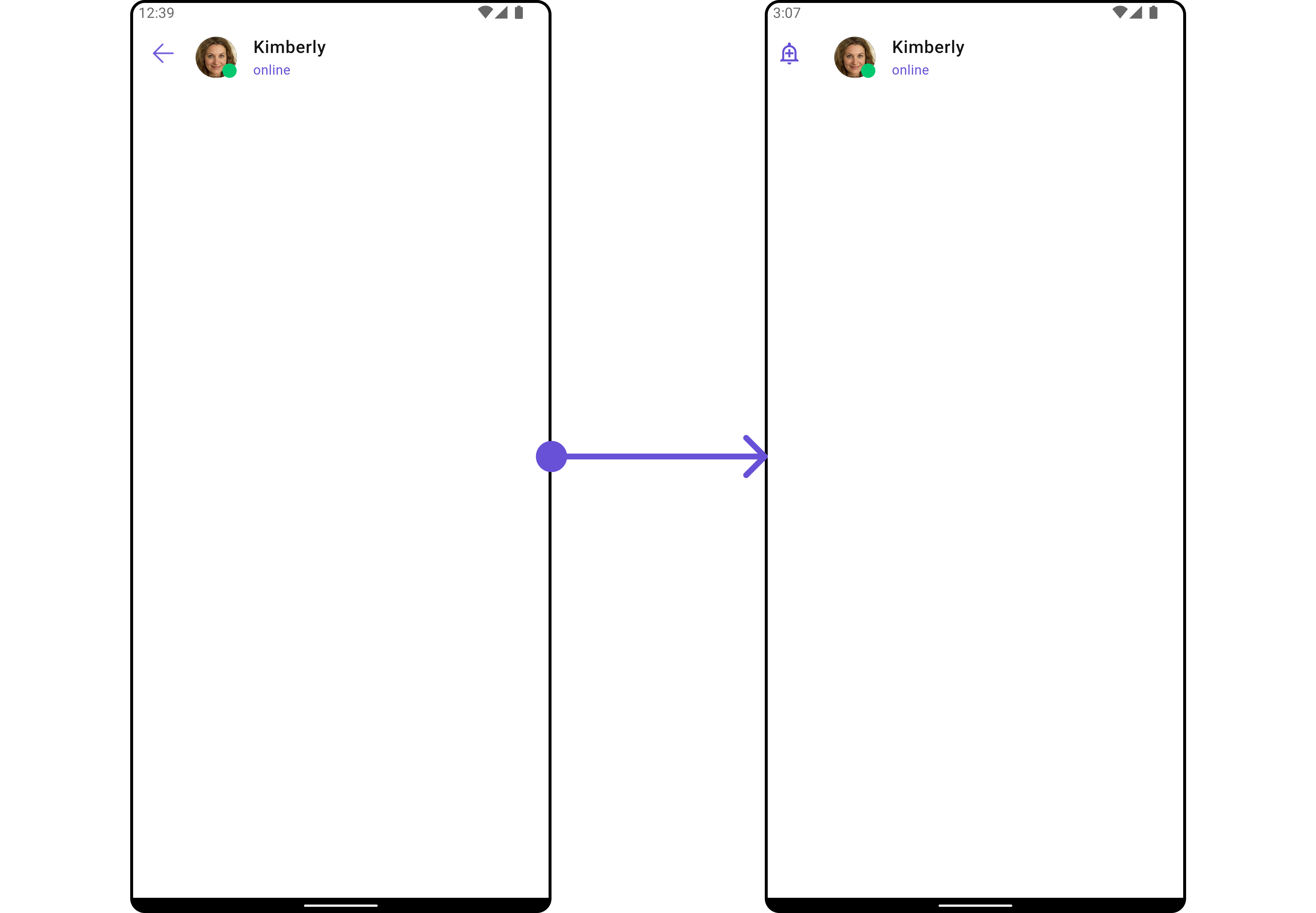
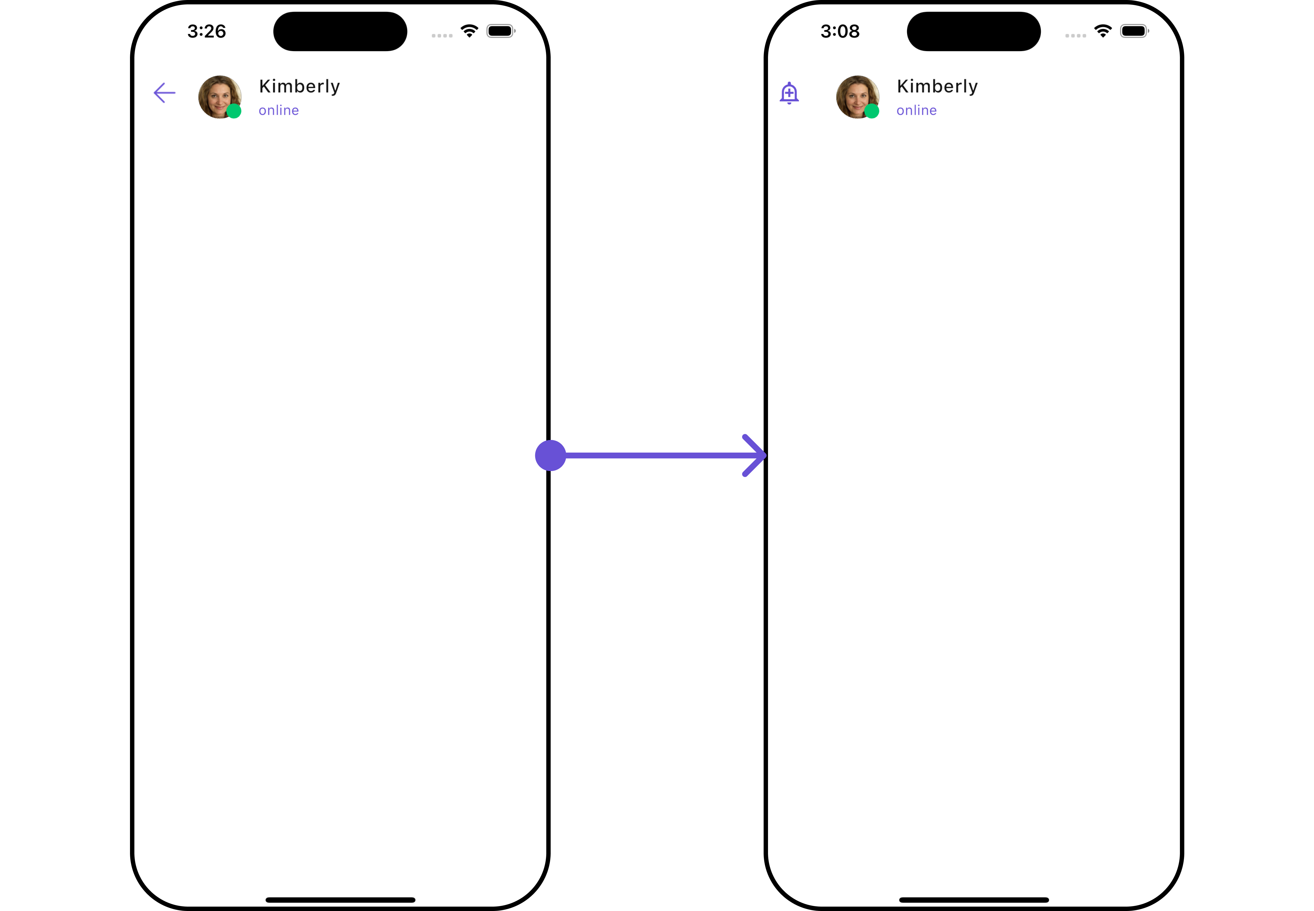
CometChatMessageHeader is a Widget that showcases the User or Group details in the toolbar. Furthermore, it also presents a typing indicator and a back navigation button for ease of use.

CometChatMessageHeader is comprised of the following components:
Usage
Integration
You can launchCometChatMessageHeader directly using Navigator.push, or you can define it as a widget within the build method of your State class.
1. Using Navigator to Launch CometChatMessageHeader
- Dart
2. Embedding CometChatMessageHeader as a Widget in the build Method
- Dart
Actions
Actions dictate how a widget functions. They are divided into two types: Predefined and User-defined. You can override either type, allowing you to tailor the behavior of the widget to fit your specific needs.1. onBack
Enhance your application’s functionality by leveraging theonBack feature. This capability allows you to customize the behavior associated with navigating back within your app. Utilize the provided code snippet to override default behaviors and tailor the user experience according to your specific requirements.
- Dart
Filters
Filters allow you to customize the data displayed in a list within aWidget. You can filter the list based on your specific criteria, allowing for a more customized. Filters can be applied using RequestBuilders of Chat SDK.
The CometChatMessageHeader widget does not have any exposed filters.
Customization
To fit your app’s design requirements, you can customize the appearance of the conversation widget. We provide exposed methods that allow you to modify the experience and behavior according to your specific needs.Style
To customize the appearance, you can assign aCometChatMessageHeaderStyle object to the CometChatMessageHeader widget.
- Dart

CometChatMessageHeaderStyle Properties
Functionality
These are a set of small functional customizations that allow you to fine-tune the overall experience of the widget. With these, you can change text, set custom icons, and toggle the visibility of UI elements.- Dart
CometChatMessageHeader Properties
Following is a list of customizations along with their corresponding code snippets:Advanced
For advanced-level customization, you can set custom views to the widget. This lets you tailor each aspect of the widget to fit your exact needs and application aesthetics. You can create and define your own widget and then incorporate those into the widget.auxiliaryButtonView
Allows adding a custom button or additional action next to the title or trailing section. Use Cases:- Add a Call button (📞) for quick voice/video calls.
- Include a Block/Report button for moderation.
- Implement a Pin Chat feature.
- Dart
ListItemView
TheCometChatMessageHeader widget consists of a ListItemView. You can customize the ListItem according to your requirements by using the .setListItemView method.
- Dart
- Dart
main.dart

leadingStateView
Defines a custom leading view, typically used for the receiver’s profile picture or avatar. Use Cases:- Display a circular profile picture with a status indicator.
- Add a custom badge for special roles (Admin, Verified ✅).
- Dart
SubtitleView
You can customize the subtitle widget for each item to meet your specific preferences and needs.- Dart

trailingView
You can set the CustomtrailingView to the CometChatMessageHeader widget.
- Dart
Options Menu
You can add custom menu options to the message header using theoptions property. These options appear in a popup menu when the menu icon is tapped.
- Dart
BackIcon
You can customize the Back Icon according to your specific requirements by using the.backButton method.
- Dart
- Android
- iOS