

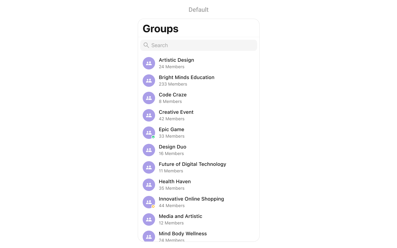
CometChatGroups component displays a searchable list of all available groups. It shows group names, avatars, member counts, and group type indicators (public/private/password-protected). Users can browse, join, and interact with group conversations.
AI Integration Quick Reference
AI Integration Quick Reference
Where It Fits
CometChatGroups displays all available groups for browsing and joining. It’s typically used as a standalone screen or within a tab view controller.
Minimal Render
Filtering
UseGroupsRequest.GroupsRequestBuilder to filter which groups appear in the list. The builder pattern allows chaining multiple filter conditions.
Filter Recipes
Actions and Events
Callback Props
onItemClick
Fires when a user taps on a group in the list. Use this to open the group chat.onItemLongClick
Fires when a user long-presses on a group. Use this to show additional options.onBack
Fires when the back button is pressed.onSelection
Fires when groups are selected in selection mode.onSelectedItemProceed
Fires when the user confirms their selection by tapping the proceed/submit button. Use this to handle the final selection action.onError
Fires when an error occurs while loading groups.onEmpty
Fires when the group list is empty.onLoad
Fires when groups are successfully loaded.Actions Reference
Global UI Events
SDK Events (Real-Time, Automatic)
Custom View Slots
listItemView
Replace the entire group row with a custom design.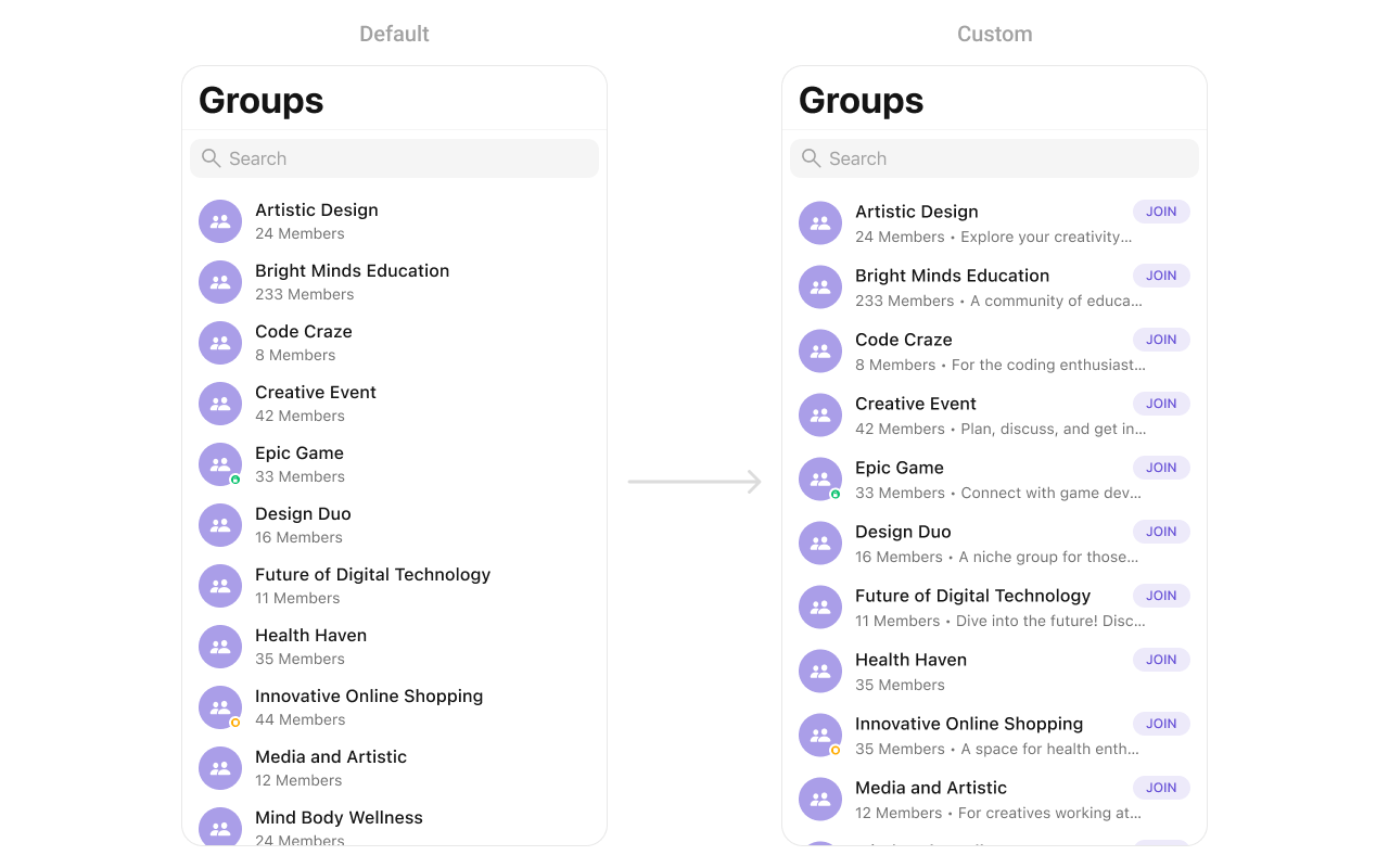
CustomGroupCell as a custom UIView:
leadingView
Customize the leading view (avatar area) of a group cell.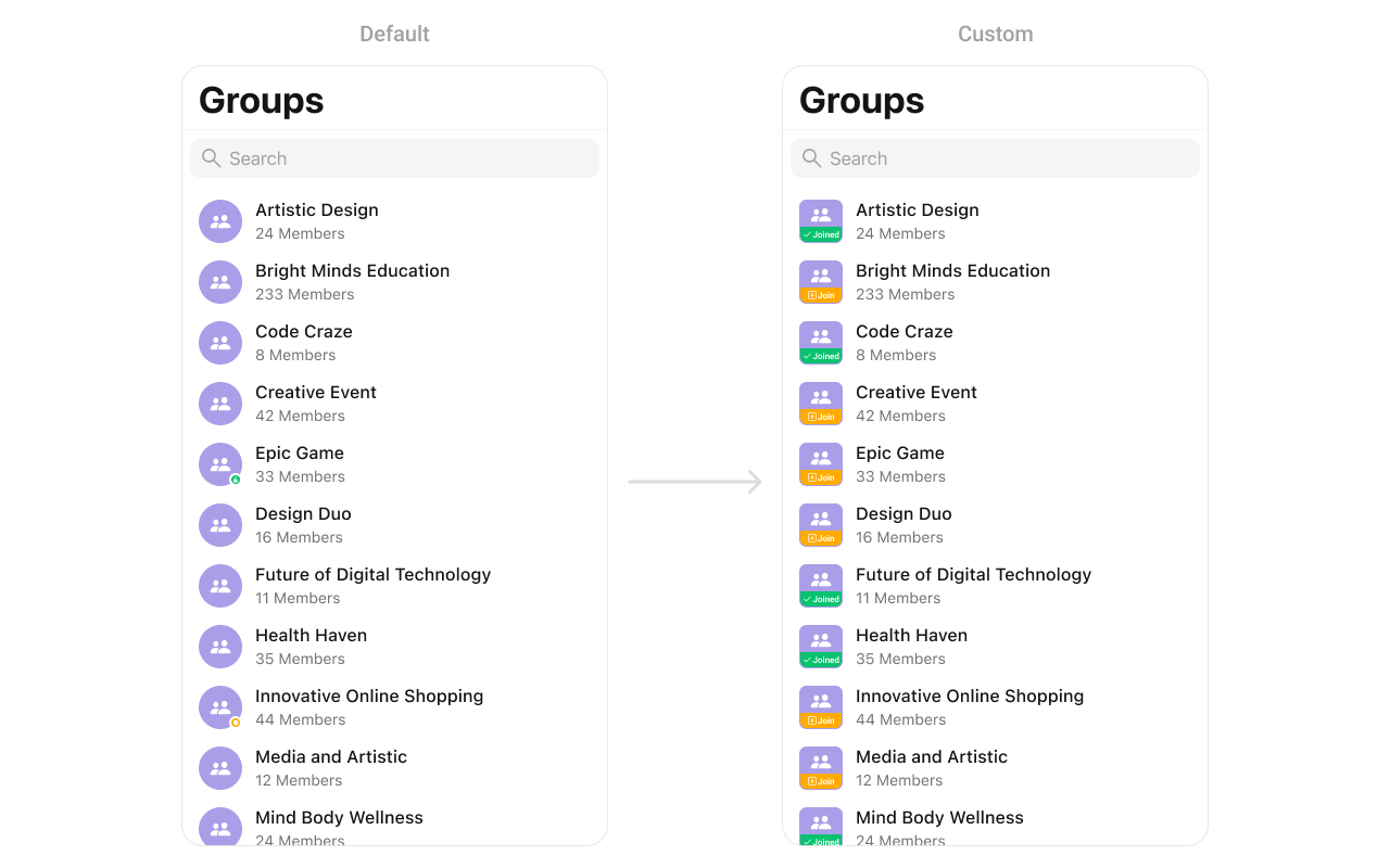
CustomLeadingView as a custom UIView:
titleView
Customize the title view of a group cell.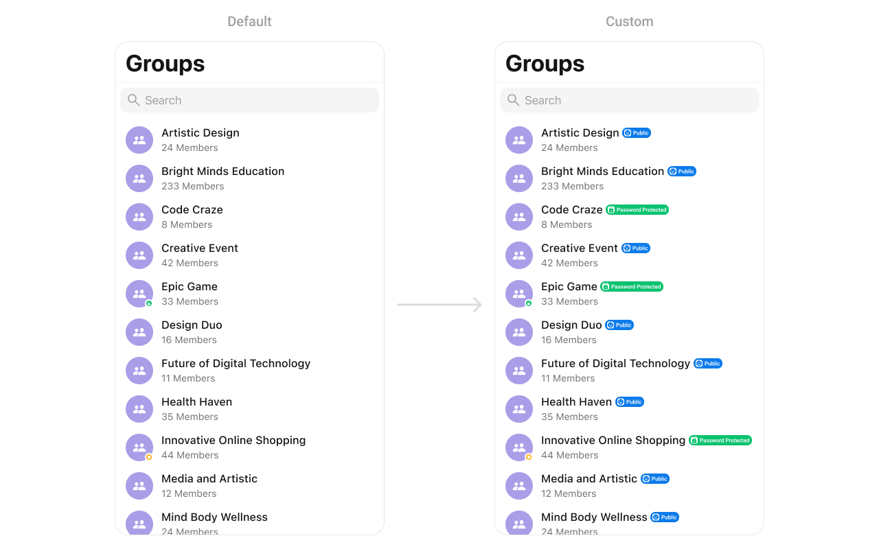
CustomTitleView as a custom UIView:
subtitleView
Customize the subtitle area below the group name.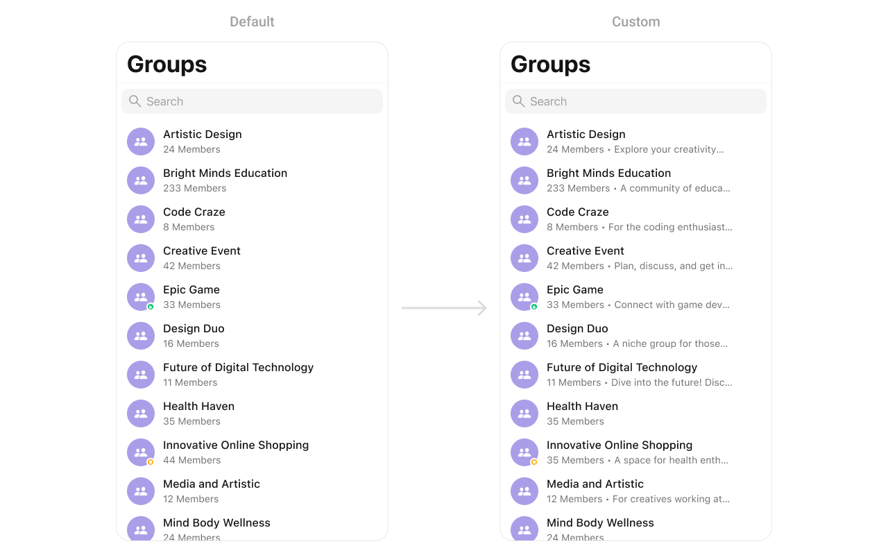
CustomSubtitleView as a custom UIView:
trailingView
Customize the trailing view (right side) of a group cell.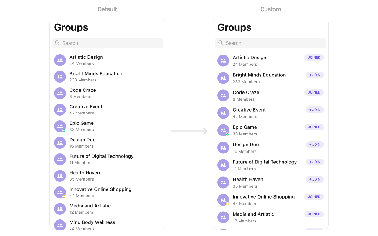
CustomTrailView as a custom UIView:
loadingStateView
Customize the loading state view displayed while data is being fetched.errorStateView
Customize the error state view displayed when an error occurs.emptyStateView
Customize the empty state view displayed when no groups are available.Options
set(options:)
Define custom swipe options for each group. This method allows you to return an array ofCometChatGroupOption based on the group object. These options appear when the user swipes on a group cell.
add(options:)
Dynamically add additional swipe options to groups while preserving the default options. This method lets you return additionalCometChatGroupOption elements that will be appended to the existing options.
Data Manipulation Methods
showJoiningGroupAlert(for:)
Displays an alert dialog when a user attempts to join a password-protected group. This method shows a prompt for the user to enter the group password.hideJoiningGroupAlert(completion:)
Dismisses the joining group alert dialog programmatically. Use this when you need to close the alert without user interaction.Styling
Style Hierarchy
- Global styles (
CometChatGroups.style) apply to all instances - Instance styles override global for specific instances
Global Level Styling
Instance Level Styling
Key Style Properties
Customization Matrix
Props
All props are optional. Sorted alphabetically.avatarStyle
Customizes the appearance of avatars in group list items.groupsRequestBuilder
Custom request builder for filtering groups.hideBackButton
Hides the back button in the navigation bar.hideErrorView
Hides the error state view.hideGroupType
Hides the public/private/password group type icons.hideLoadingState
Hides the loading state indicator.hideNavigationBar
Hides the entire navigation bar.hideSearch
Hides the search bar.hideSectionHeader
Hides the alphabetical section headers.searchRequestBuilder
Custom request builder for search functionality.selectedCellCount
Returns the count of currently selected groups when in selection mode.selectionLimit
Sets the maximum number of groups that can be selected in selection mode. When the limit is reached, further selections are disabled.selectionMode
Sets the selection mode for multi-select functionality.statusIndicatorStyle
Customizes the appearance of group type status indicators.Events
Common Patterns
Public groups only
Joined groups only
Custom empty state with CTA
Hide all chrome — minimal list
Multi-select groups
Related Components
- Messages - Display messages in a group
- Conversations - List all conversations
- Users - List all users
- Group Members - Manage group members
- Groups With Messages - Combined groups and messages view