

AI Integration Quick Reference
AI Integration Quick Reference
CometChatThemeProvider to match your brand.
Color Token Reference
This table maps every commonly used token to what it visually controls.Overview
Colors inCometChatTheme allow you to maintain a consistent visual identity across your application by providing predefined colors for various UI elements, such as text, buttons, backgrounds, alerts, and more. These color definitions seamlessly adapt to both light and dark themes, ensuring an optimal user experience across different modes.
The color resources are divided into the following categories:
- Primary Colors: Define the main theme of the application.
- Neutral Colors: Used for backgrounds, borders, and secondary UI elements.
- Alert Colors: Highlight states like success, warning, error, or information.
- Text Colors: Used for typography.
- Icon Colors: Define icon appearances.
- Button Colors: Customize button backgrounds, icons, and text.
Usage
Default Colors
CometChat provides predefined color sets for both light and dark modes, ensuring optimal visual contrast and accessibility across your application. These colors can be accessed through thetheme value, which is obtained using the useTheme() hook.
Example: Colors
- Light Mode Colors
- Dark Mode Colors
50-100 are generated based on the following blend percentages.
Extended primary colors, as well as background, text, button, and other UI colors, are automatically derived from the provided primary and neutral colors. However, any colors explicitly overridden in the theme via
CometChatThemeProvider will take precedence over the generated values.Customizing Colors
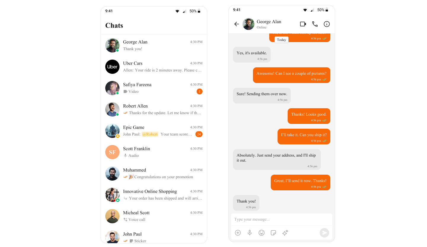
You can override the default colors to align them with your application’s branding. Example: Changing the primary and textPrimary colors.- TypeScript
Next Steps
Introduction to Theming
Learn how CometChatThemeProvider manages light and dark modes
Message Bubble Styling
Style individual message bubbles and their content
Localize
Translate UI strings and support multiple languages
Components Overview
Explore all available UI Kit components