

Overview
The Conversations is a Component, That shows all conversations for the currently logged-in user,- iOS
- Android
Usage
Integration
To use Conversations in your component, use the following code snippet:App.tsx
Actions
Actions dictate how a component functions. They are divided into two types: Predefined and User-defined. You can override either type, allowing you to tailor the behavior of the component to fit your specific needs.1. onItemPress
OnItemPress is triggered when you press on a ListItem of the Conversations component. The OnItemPress action doesn’t have a predefined behavior. You can override this action using the following code snippet.
- App.tsx
2. onItemLongPress
onItemLongPress is triggered when you long press on a ListItem of the Conversations component. The onItemLongPress action doesn’t have a predefined behavior. You can override this action using the following code snippet.
- App.tsx
3. onSelection
TheonSelection event is triggered upon the completion of a selection in SelectionMode. It does not have a default behavior. However, you can override its behavior using the following code snippet.
- App.tsx
4. onBack
onBack is triggered when you press the back button in the app bar. It does not have a default behavior. However, you can override its behavior using the following code snippet.
- App.tsx
5. OnError
This action doesn’t change the behavior of the component but rather listens for any errors that occur in the Conversations component.- App.tsx
Filters
You can setConversationsRequestBuilder in the Conversations Component to filter the conversation list. You can modify the builder as per your specific requirements with multiple options available to know more refer to ConversationRequestBuilder.
You can set filters using the following parameters.
- Conversation Type: Filters on type of Conversation,
UserorGroups - Limit: Number of conversations fetched in a single request.
- WithTags: Filter on fetching conversations containing tags
- Tags: Filters on specific
Tag - UserTags: Filters on specific User
Tag - GroupTags: Filters on specific Group
Tag
- App.tsx
Events
Events are emitted by aComponent. By using event you can extend existing functionality. Being global events, they can be applied in Multiple Locations and are capable of being Added or Removed.
- Add Listener
- Remove Listener
Customization
To fit your app’s design requirements, you can customize the appearance of the conversation component. We provide exposed methods that allow you to modify the experience and behavior according to your specific needs.Style
Using Style you can customize the look and feel of the component in your app, These parameters typically control elements such as the color, size, shape, and fonts used within the component.1. Conversations Style
You can set theConversationsStyle to the Conversations Component to customize the styling.
- App.tsx
2. Avatar Style
To apply customized styles to theAvatar component in the Conversations Component, you can use the following code snippet. For further insights on Avatar Styles refer
- App.tsx
3. StatusIndicator Style
To apply customized styles to the Status Indicator component in theConversations Component, you can use the following code snippet. For further insights on Status Indicator Styles refer
- App.tsx
4. Date Style
To apply customized styles to theDate component in the Conversations Component, you can use the following code snippet. For further insights on Date Styles refer
- App.tsx
5. Badge Style
To apply customized styles to theBadge component in the Conversations Component, you can use the following code snippet. For further insights on Badge Styles refer
- App.tsx
6. Confirm Dialog Style
To apply customized styles to thedelete dialog component in the Conversations Component, you can use the following code snippet.
- App.tsx
6. List Item Style
To apply customized styles to theListItemStyle component in the Conversations Component, you can use the following code snippet. For further insights on ListItemStyle Styles refer
- App.tsx
Functionality
These are a set of small functional customizations that allow you to fine-tune the overall experience of the component. With these, you can change text, set custom icons, and toggle the visibility of UI elements.- App.tsx
Advanced
For advanced-level customization, you can set custom views to the component. This lets you tailor each aspect of the component to fit your exact needs and application aesthetics. You can create and define your views, layouts, and UI elements and then incorporate those into the component.ListItemView
With this function, you can assign a custom ListItem to the Conversations Component.- TypeScript
- iOS
- Android
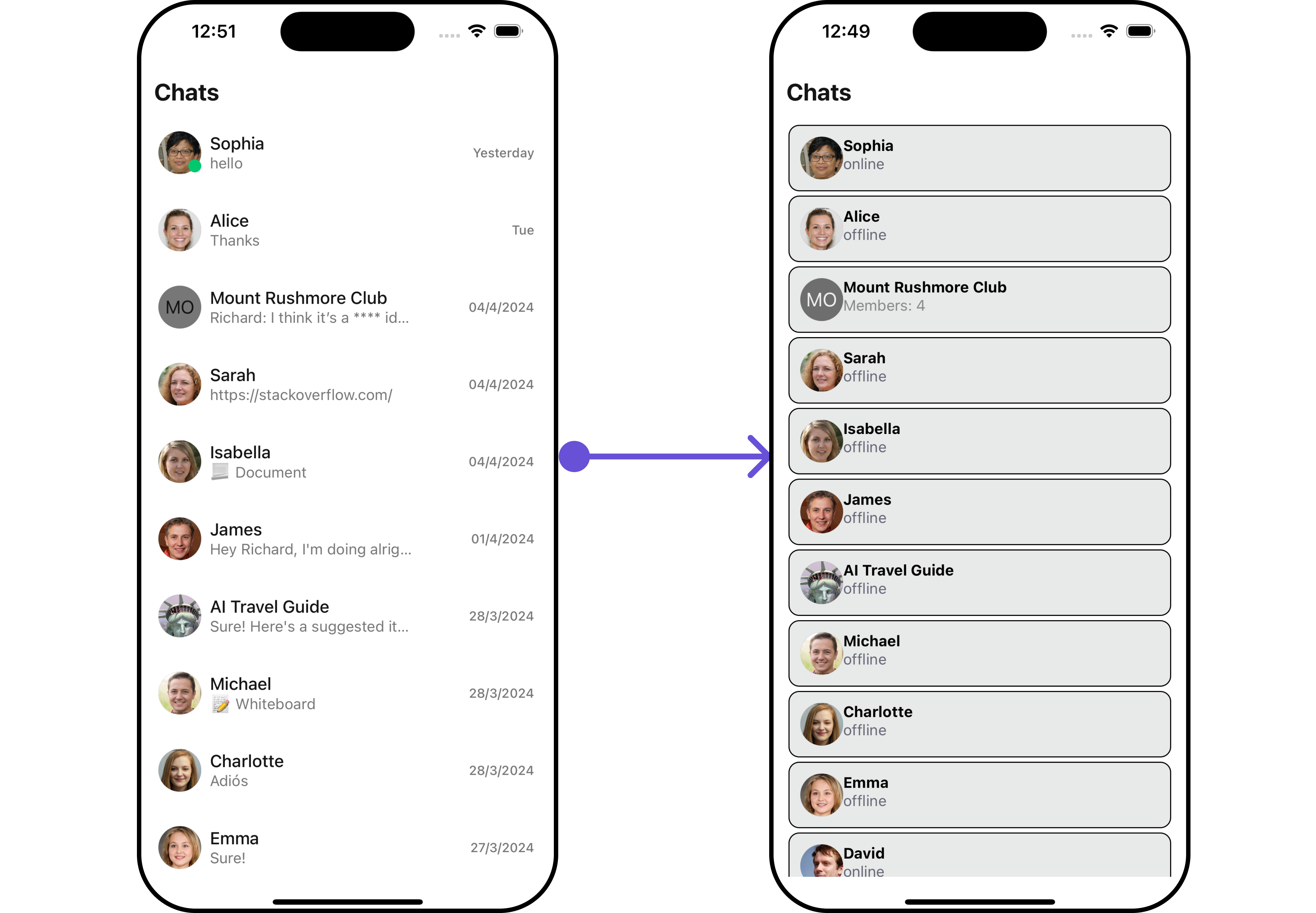
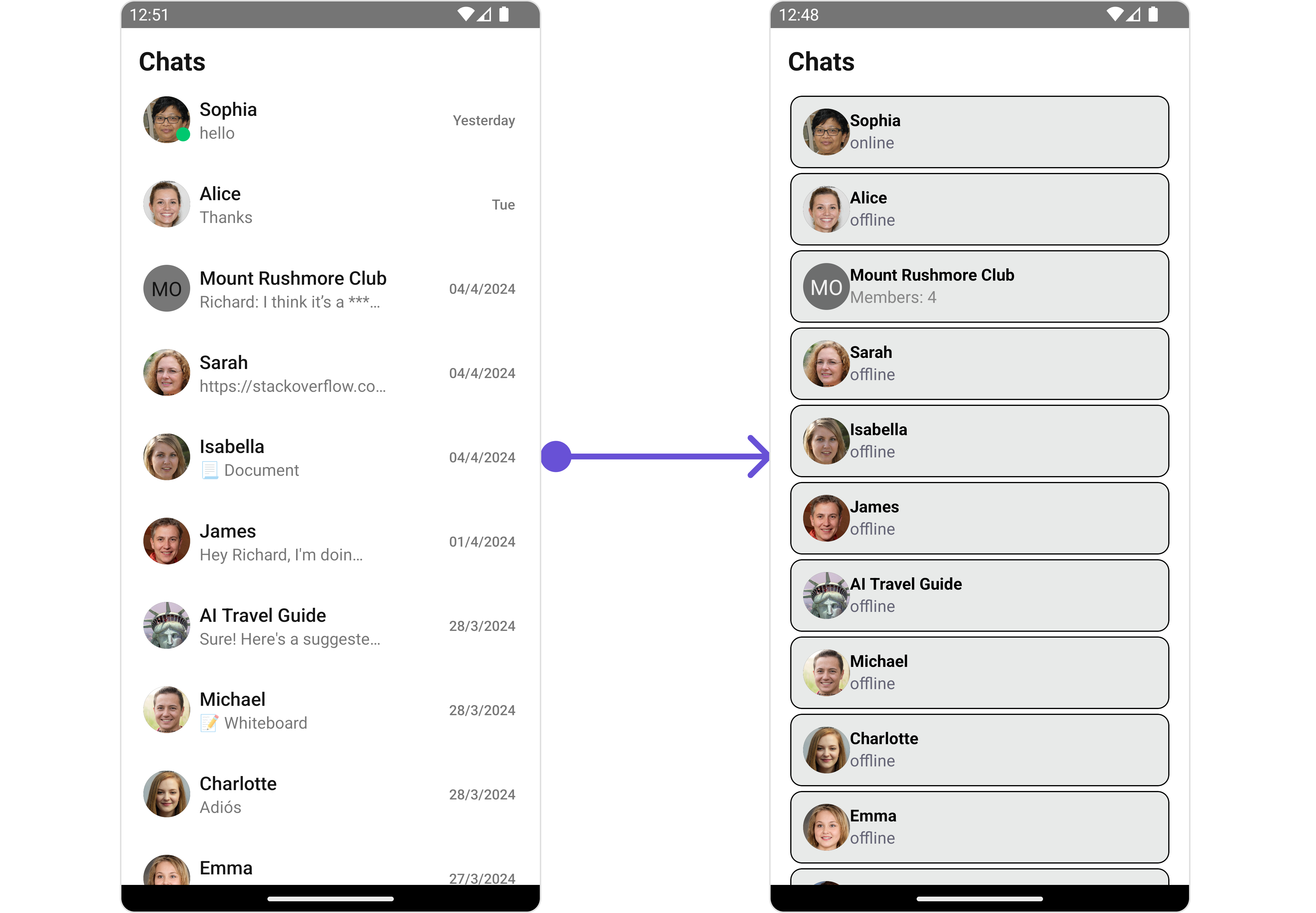
getListItemView function as follows:
- TypeScript
TextFormatters
Assigns the list of text formatters. If the provided list is not null, it sets the list. Otherwise, it assigns the default text formatters retrieved from the data source. To configure the existing Mentions look and feel check out CometChatMentionsFormatter- ShortCutFormatter.ts
- App.tsx
AppBarOptions
You can set the Custom AppBar Options to add more options to the Conversations component.- TypeScript
- iOS
- Android
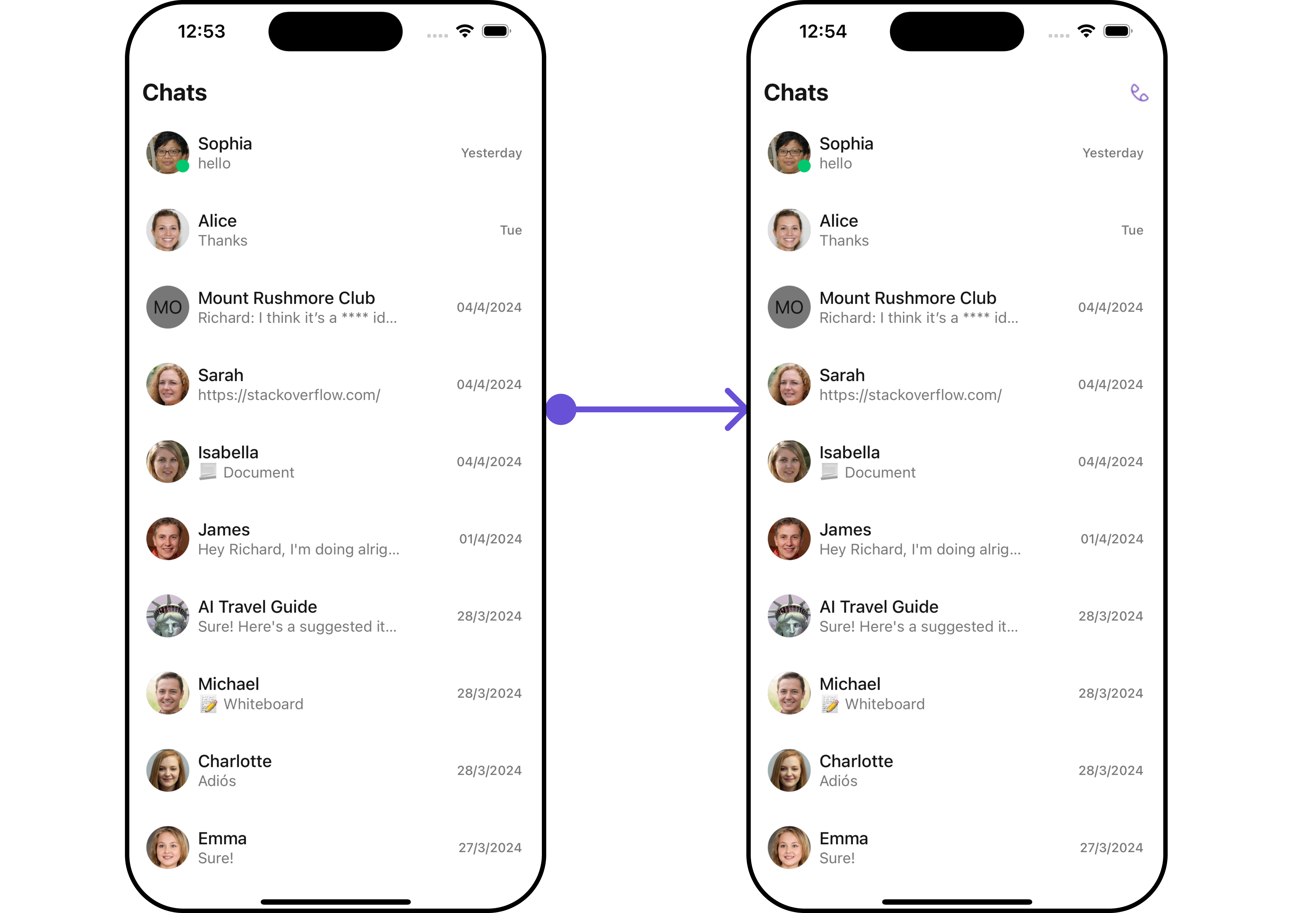
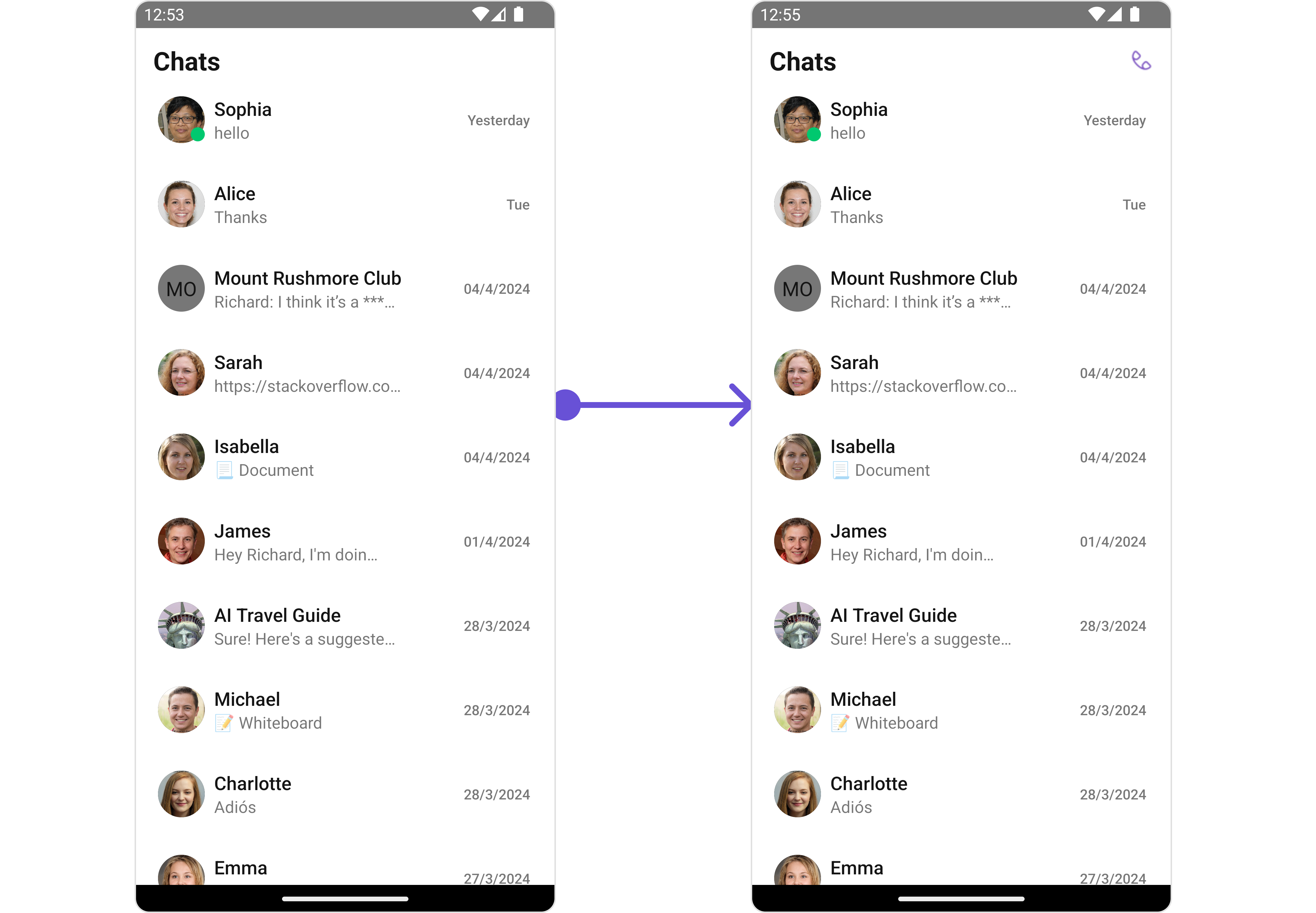
getAppBarOptions function as follows:
- TypeScript
DatePattern
You can modify the date pattern to your requirement using DatePattern. datePattern formats date and time values according to a predefined standard, enhancing consistency and clarity in their presentation.- App.tsx
- iOS
- Android
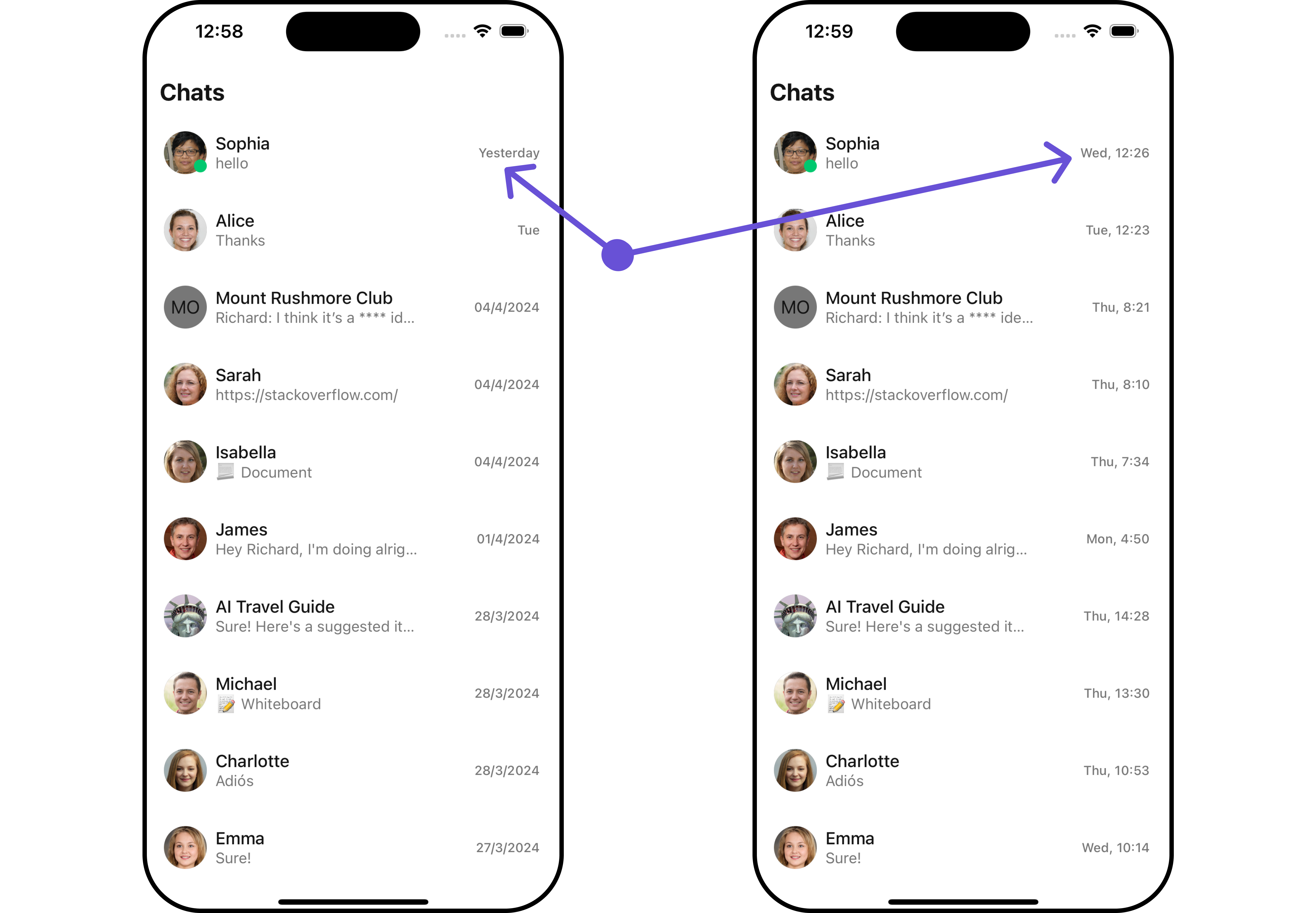
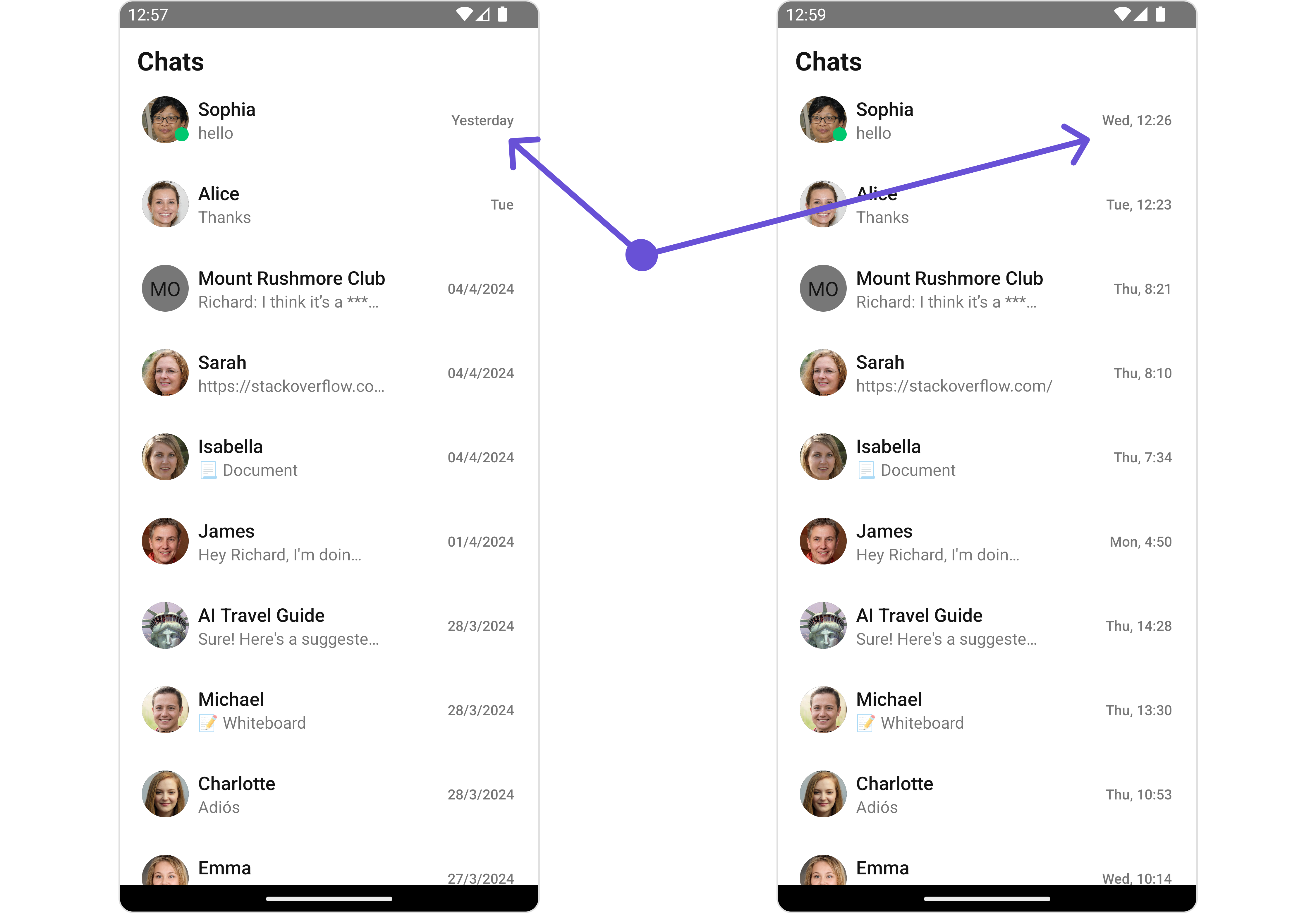
Subtitle View
You can customize the subtitle view for each conversation item to meet your requirements- App.tsx
- iOS
- Android
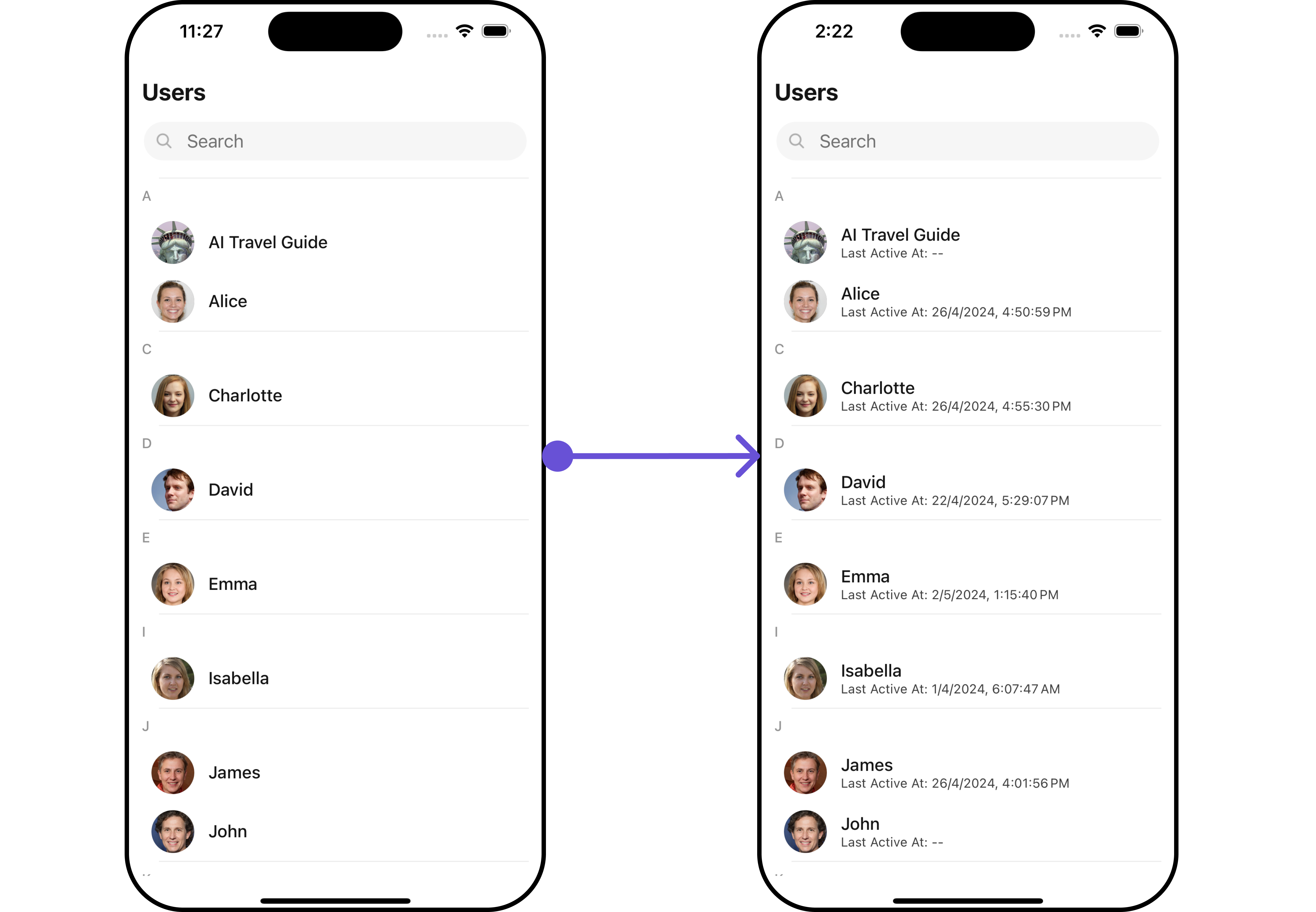
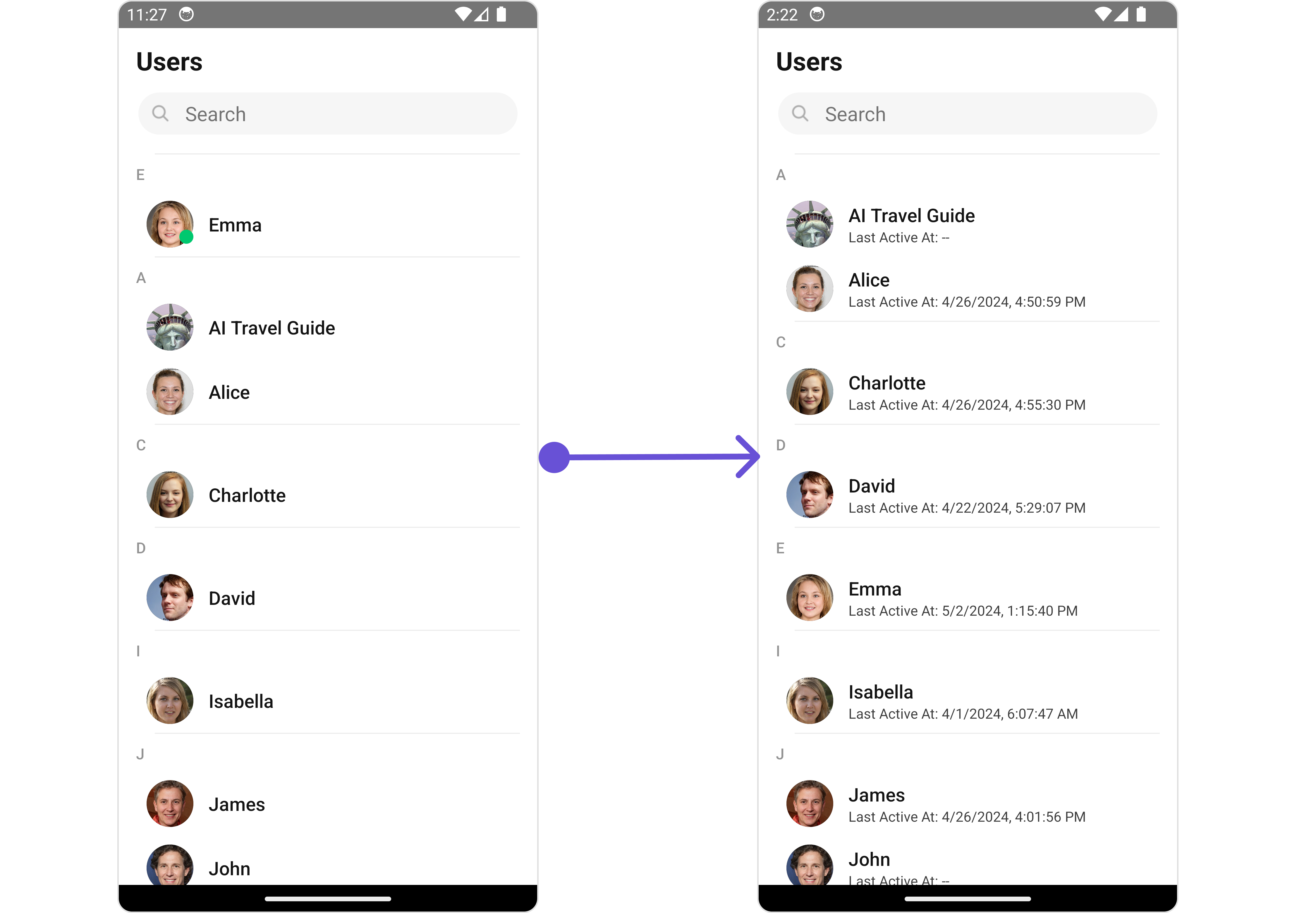
getSubtitleView function as follows:
- App.tsx
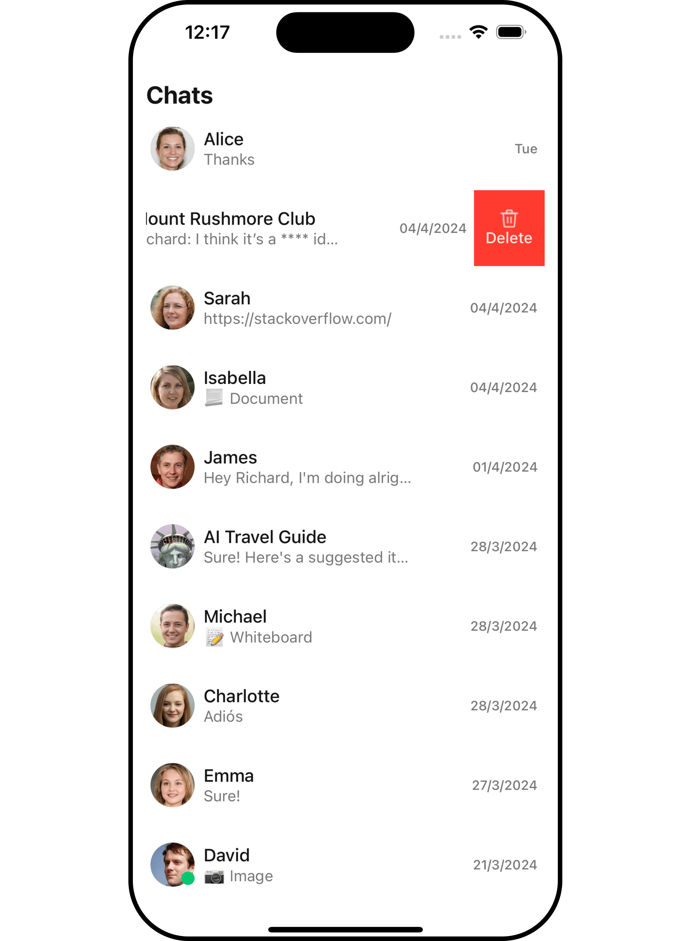
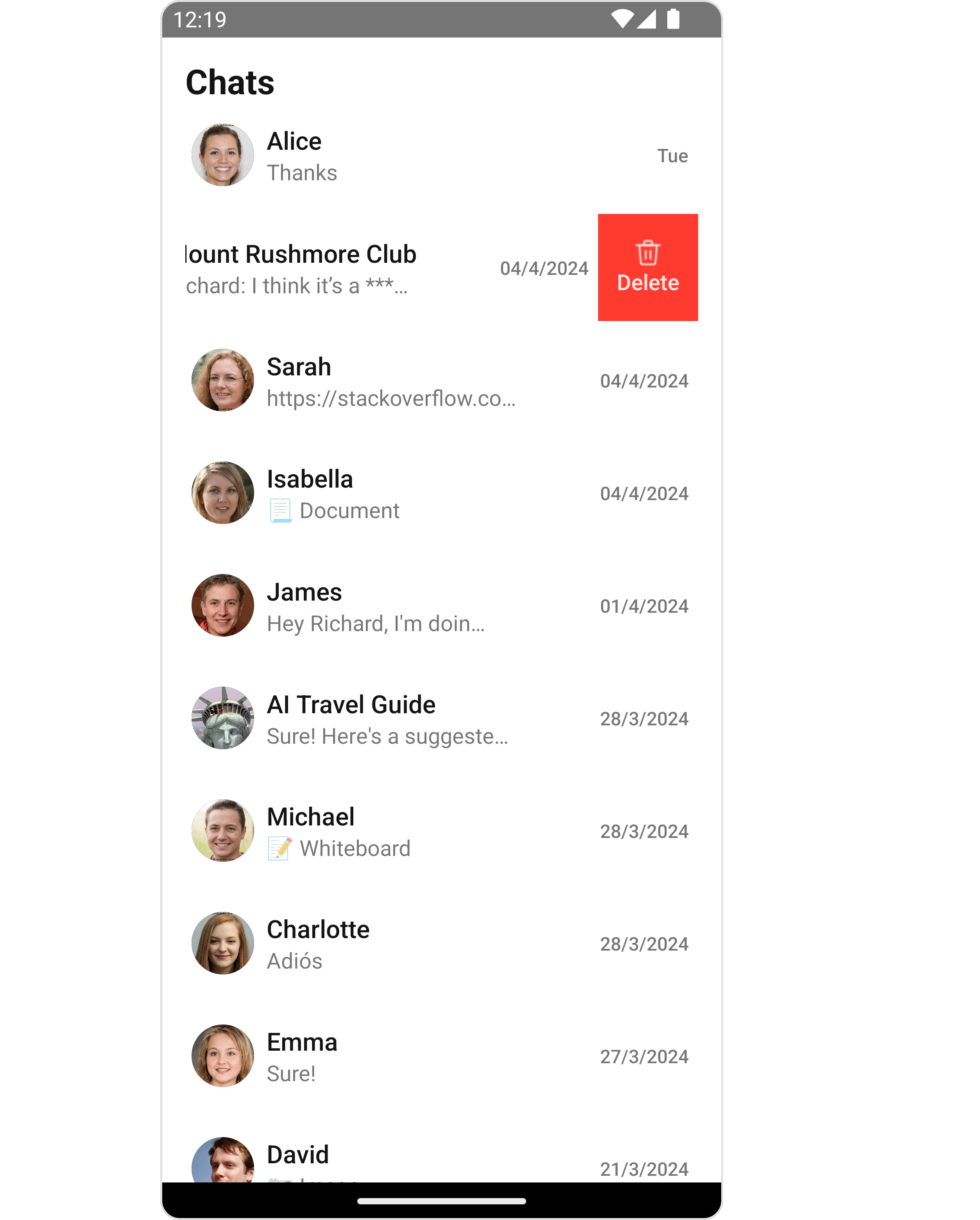
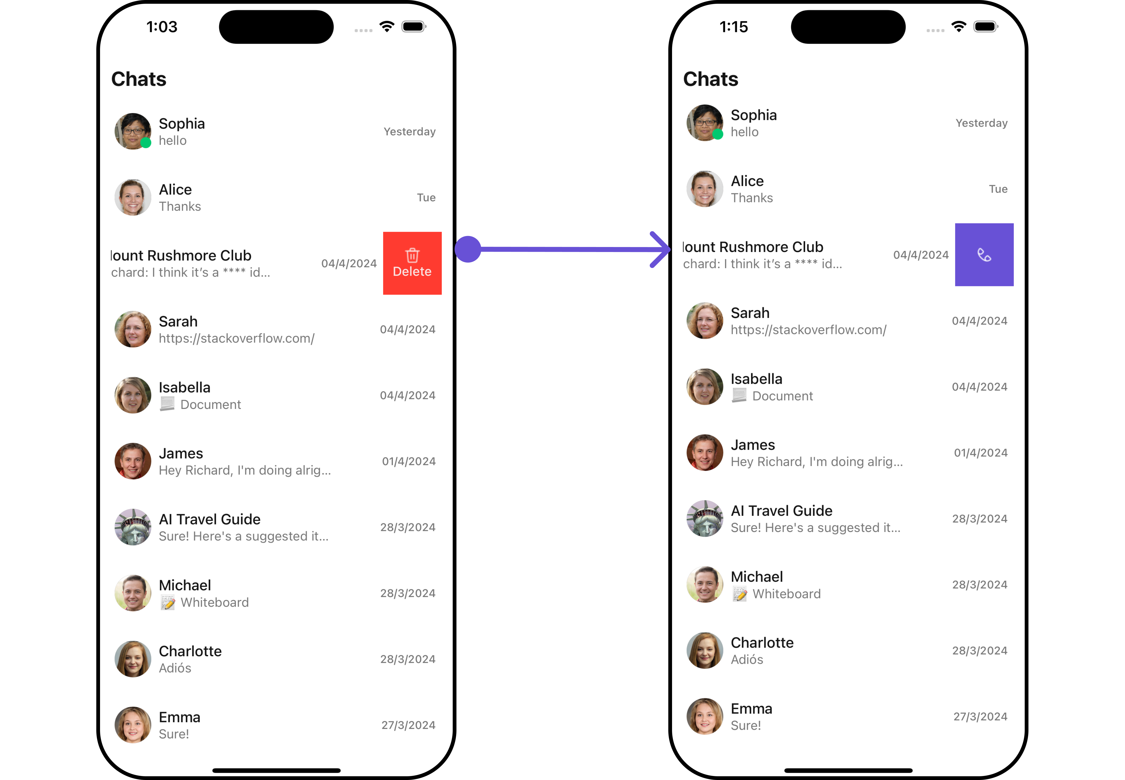
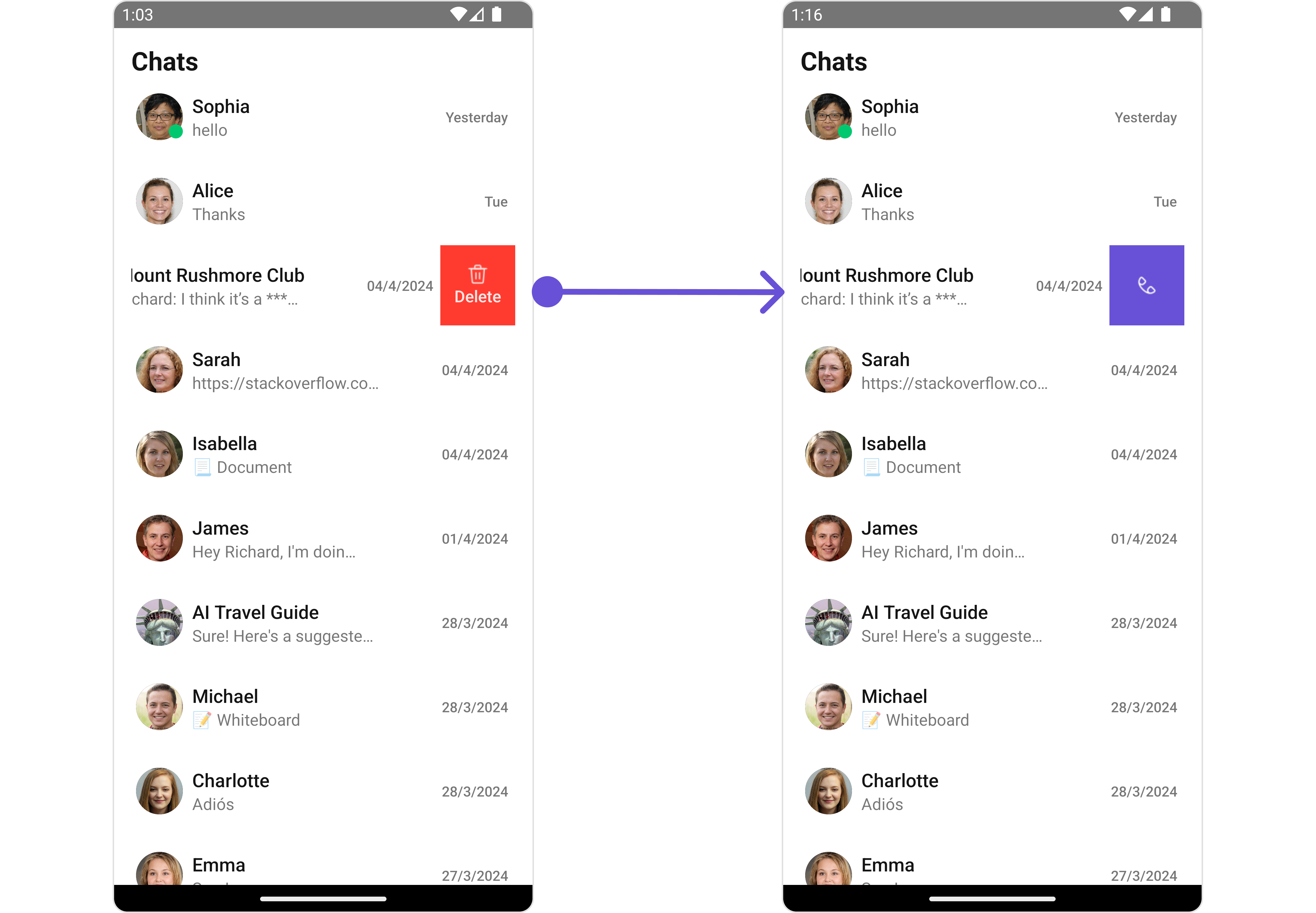
Swipe Options
This prop will add the array of options on swipe to perform actions on Conversation.Structure of CometChatOptions
Demonstration
- iOS
- Android
- TypeScript
Loading State View
You can set a custom loader view usingLoadingStateView to match the loading view of your app.
- TypeScript
- iOS
- Android
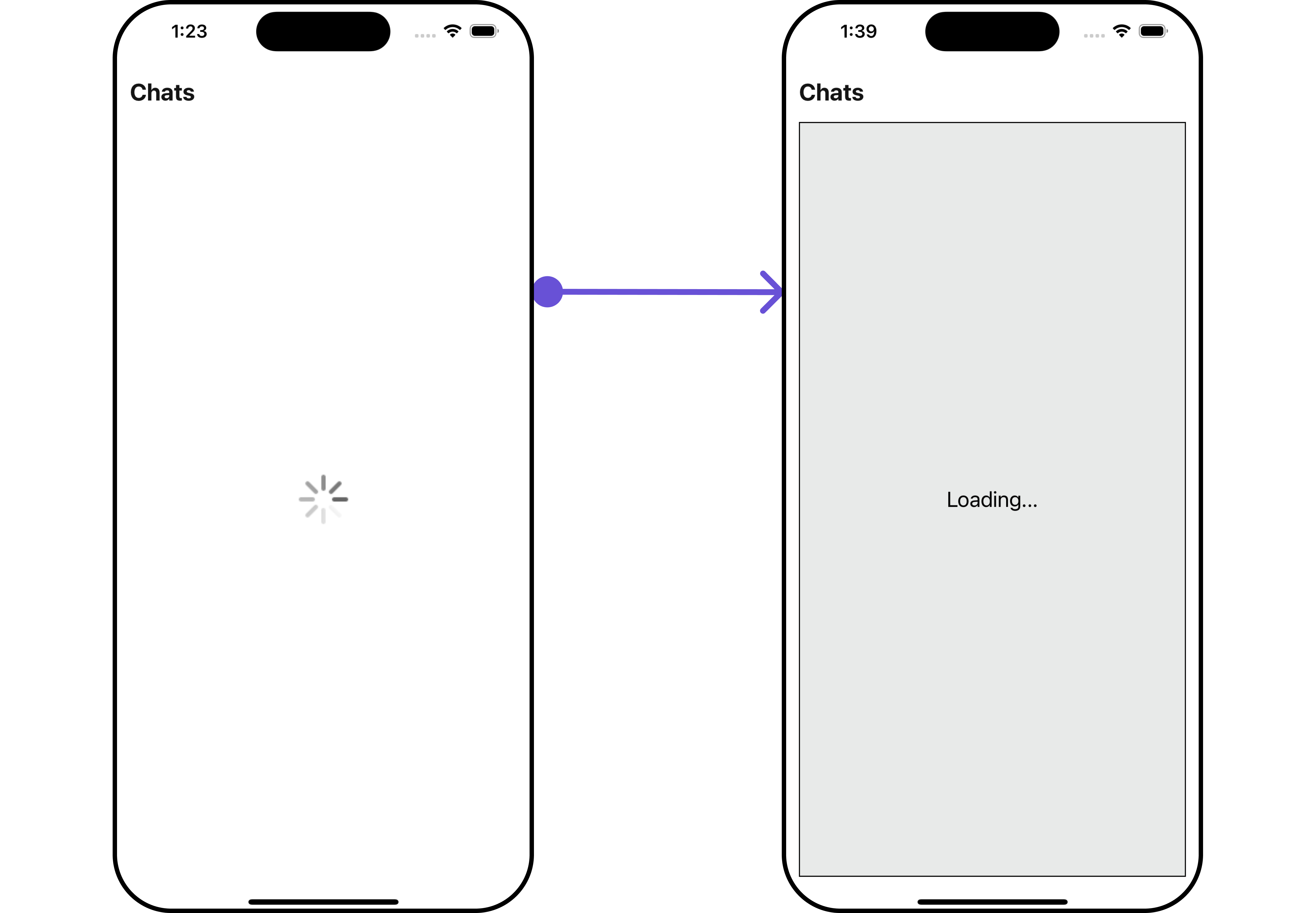
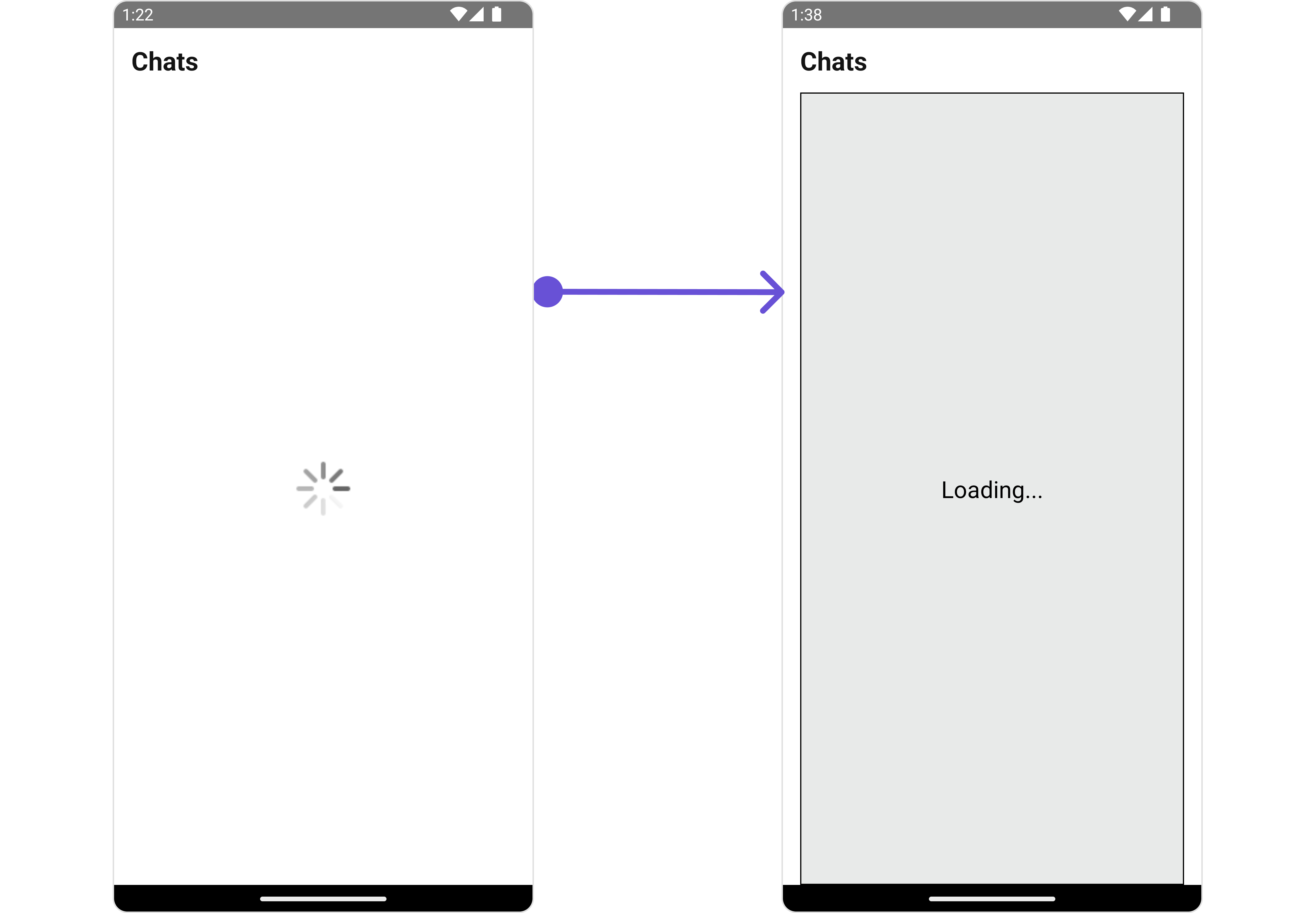
getLoadingStateView function as follows:
- App.tsx