

Overview
CometChatGroupMembers is a Component that displays all users added or invited to a group, granting them access to group discussions, shared content, and collaborative features. Group members can communicate in real-time via messaging, voice and video calls, and other activities. They can interact, share files, and join calls based on group permissions set by the administrator or owner.
- iOS
- Android
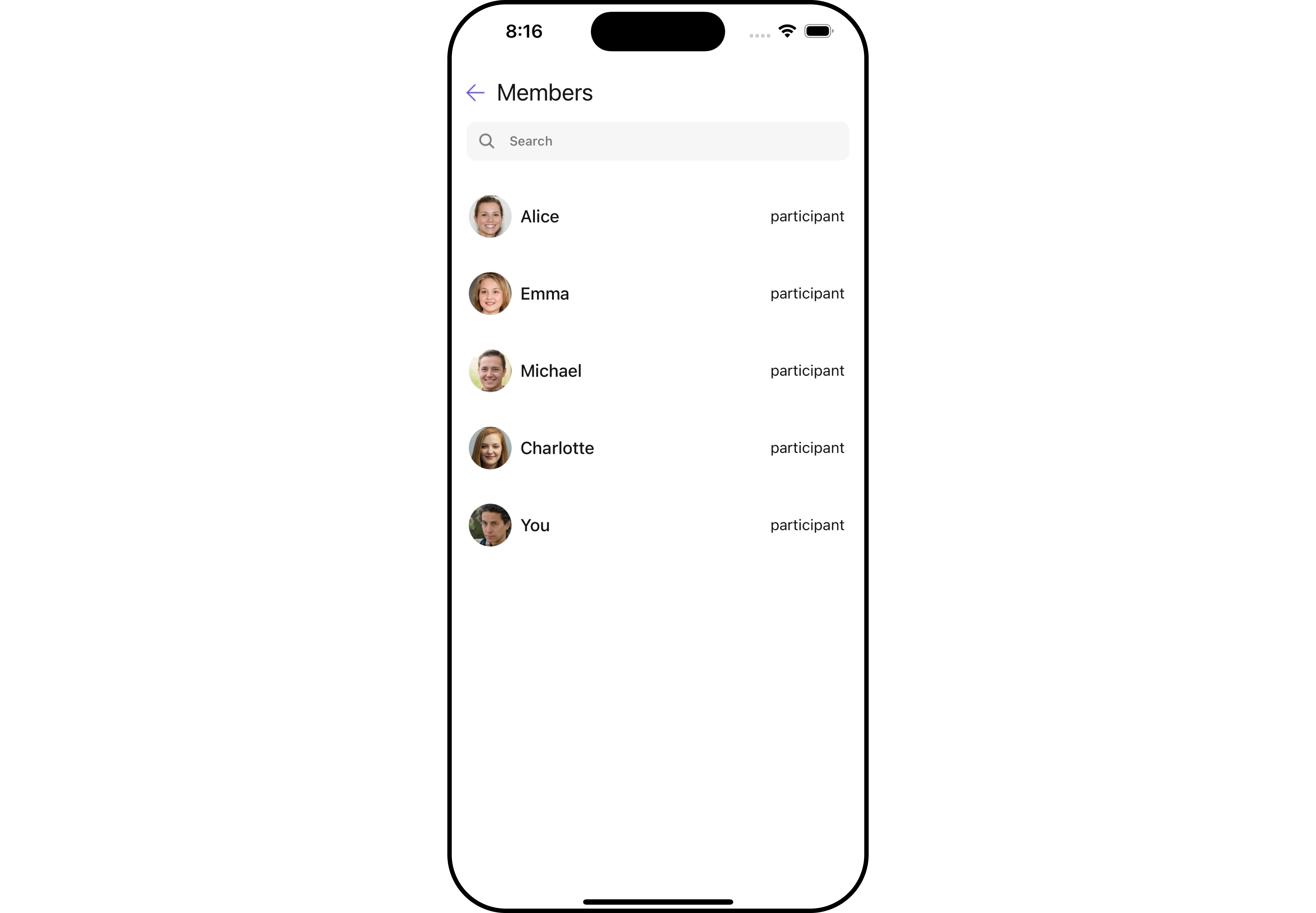
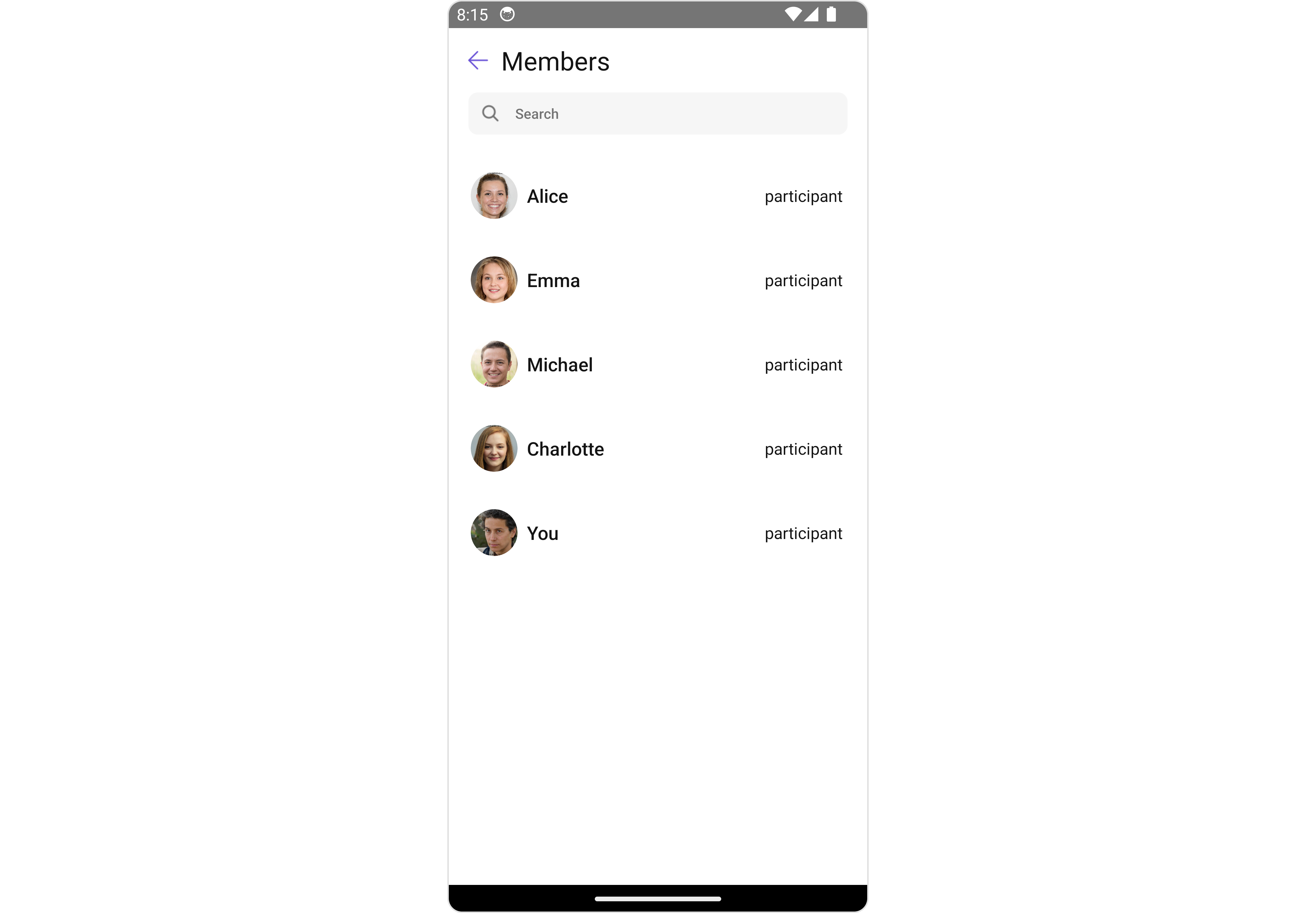
Usage
Integration
The following code snippet illustrates how you can directly incorporate the Group Members component into your Application.- App.tsx
Actions
Actions dictate how a component functions. They are divided into two types: Predefined and User-defined. You can override either type, allowing you to tailor the behavior of the component to fit your specific needs.1. onSelect
TheonSelect action is activated when you select the done icon while in selection mode. This returns a list of all the group members that you have selected.
This action does not come with any predefined behavior. However, you have the flexibility to override this event and tailor it to suit your needs using the following code snippet.
- App.tsx
2. onItemPress
TheonItemPress event is activated when you click on the Group Members List item. This action does not come with any predefined behavior. However, you have the flexibility to override this event and tailor it to suit your needs using the following code snippet.
- App.tsx
2. onItemLongPress
TheonItemLongPress event is activated when you click on the Group Members List item. This action does not come with any predefined behavior. However, you have the flexibility to override this event and tailor it to suit your needs using the following code snippet.
- App.tsx
3. OnBack
OnBack is triggered when you click on the back button of the Group Members component. You can override this action using the following code snippet.
- App.tsx
4. onError
This action doesn’t change the behavior of the component but rather listens for any errors that occur in the Group Membets component.- App.tsx
Filters
Filters allow you to customize the data displayed in a list within a Component. You can filter the list based on your specific criteria, allowing for a more customized. Filters can be applied using RequestBuilders of Chat SDK.1. GroupMembersRequestBuilder
The GroupMembersRequestBuilder enables you to filter and customize the group members list based on available parameters in GroupMembersRequestBuilder. This feature allows you to create more specific and targeted queries when fetching groups. The following are the parameters available in GroupMembersRequestBuilder
Example
In the example below, we are applying a filter to the Group Members by setting the limit to two and setting the scope to show only admin and moderator.
- App.tsx
2. SearchRequestBuilder
The SearchRequestBuilder uses GroupMembersRequestBuilder enables you to filter and customize the search list based on available parameters in GroupMembersRequestBuilder. This feature allows you to keep uniformity between the displayed Group Members List and searched Group Members List. Example- App.tsx
Events
Events are emitted by aComponent. By using event you can extend existing functionality. Being global events, they can be applied in Multiple Locations and are capable of being Added or Removed.
Events emitted by the Group Members component is as follows.
- Adding Listeners
- Removing Listeners
Customization
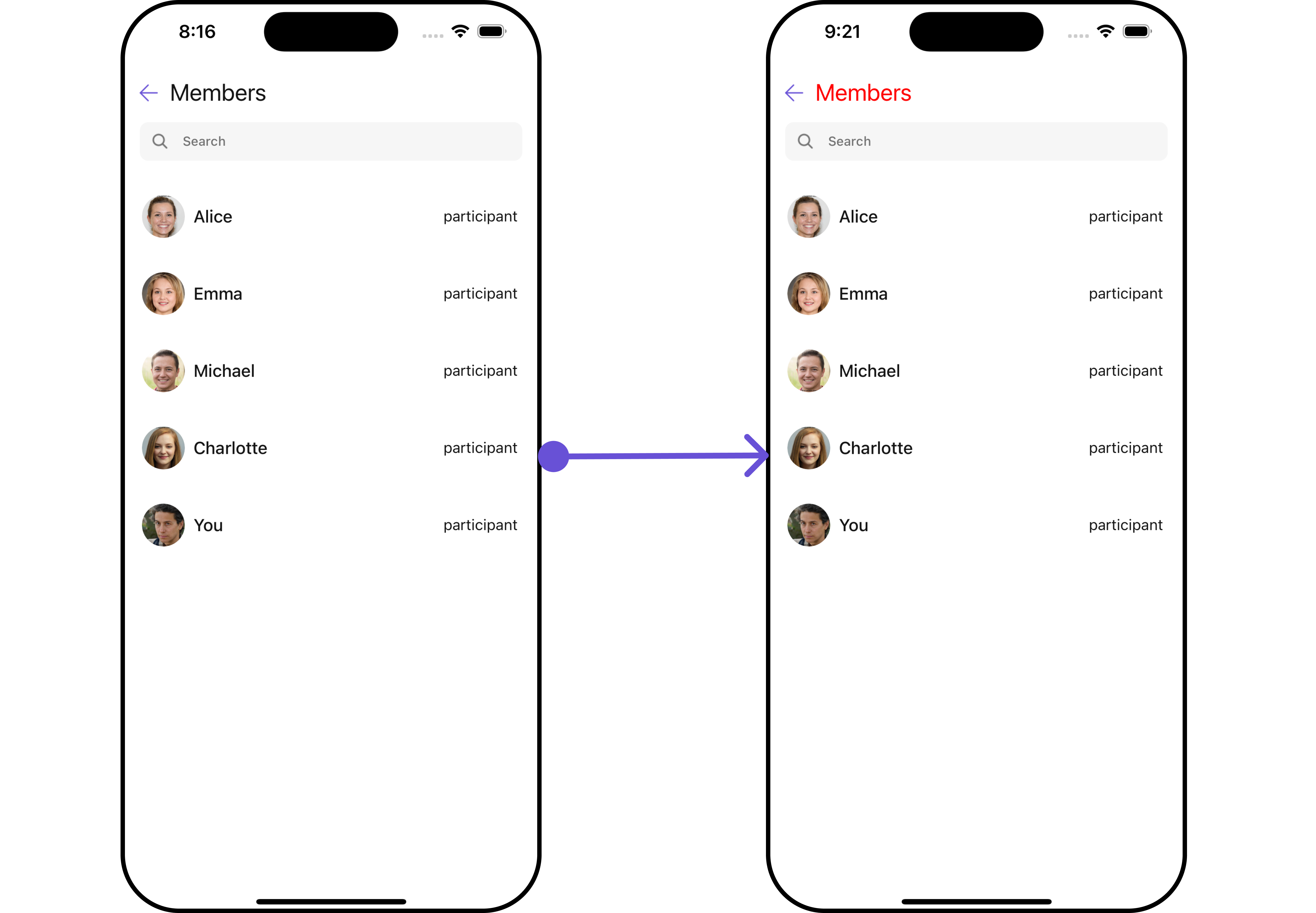
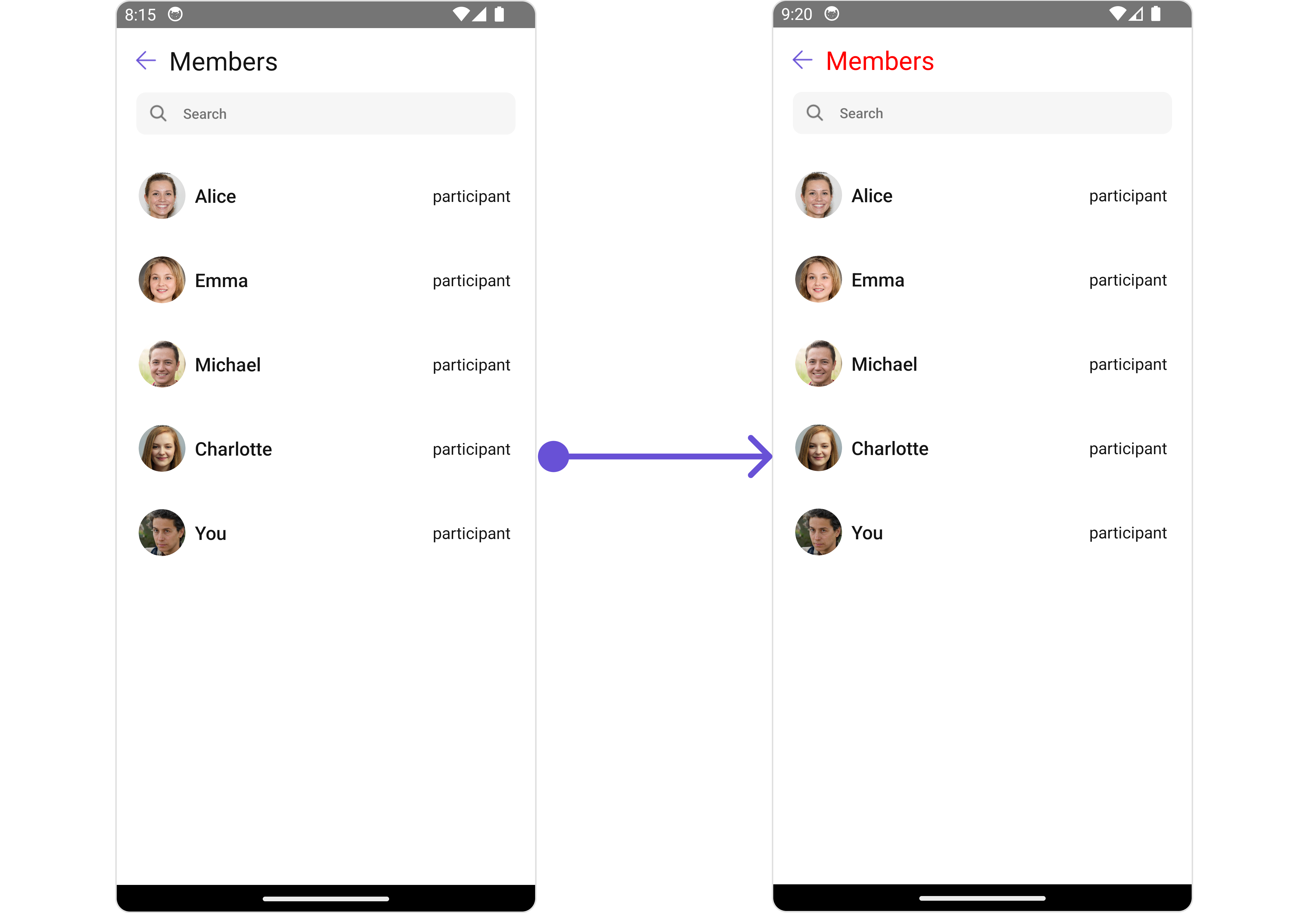
To fit your app’s design requirements, you can customize the appearance of the Group Members component. We provide exposed methods that allow you to modify the experience and behavior according to your specific needs.Style
Using Style you can customize the look and feel of the component in your app, These parameters typically control elements such as the color, size, shape, and fonts used within the component.1. GroupMembers Style
You can set theGroupMembersStyle to the Group Members Component to customize the styling.
- iOS
- Android
- App.tsx
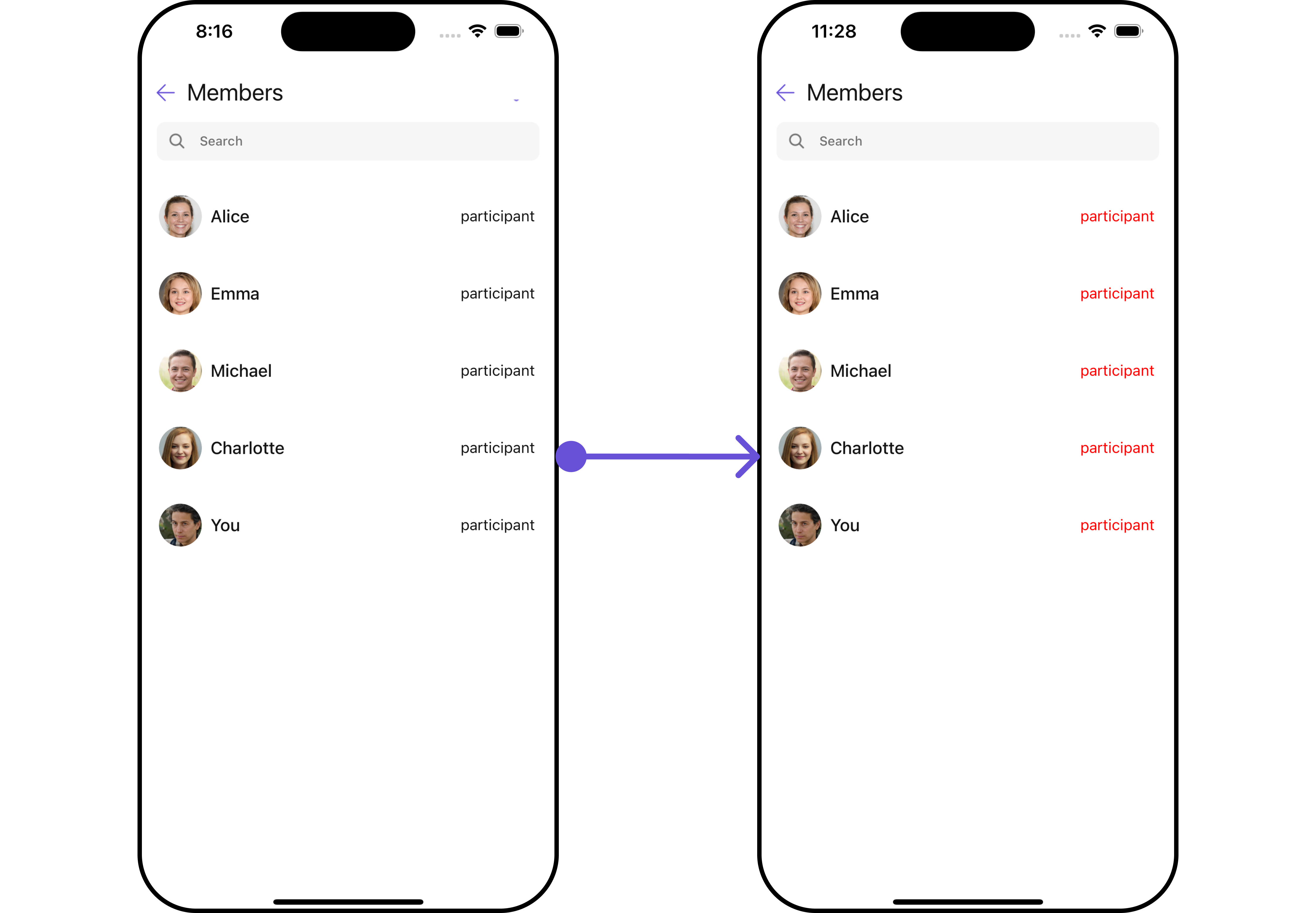
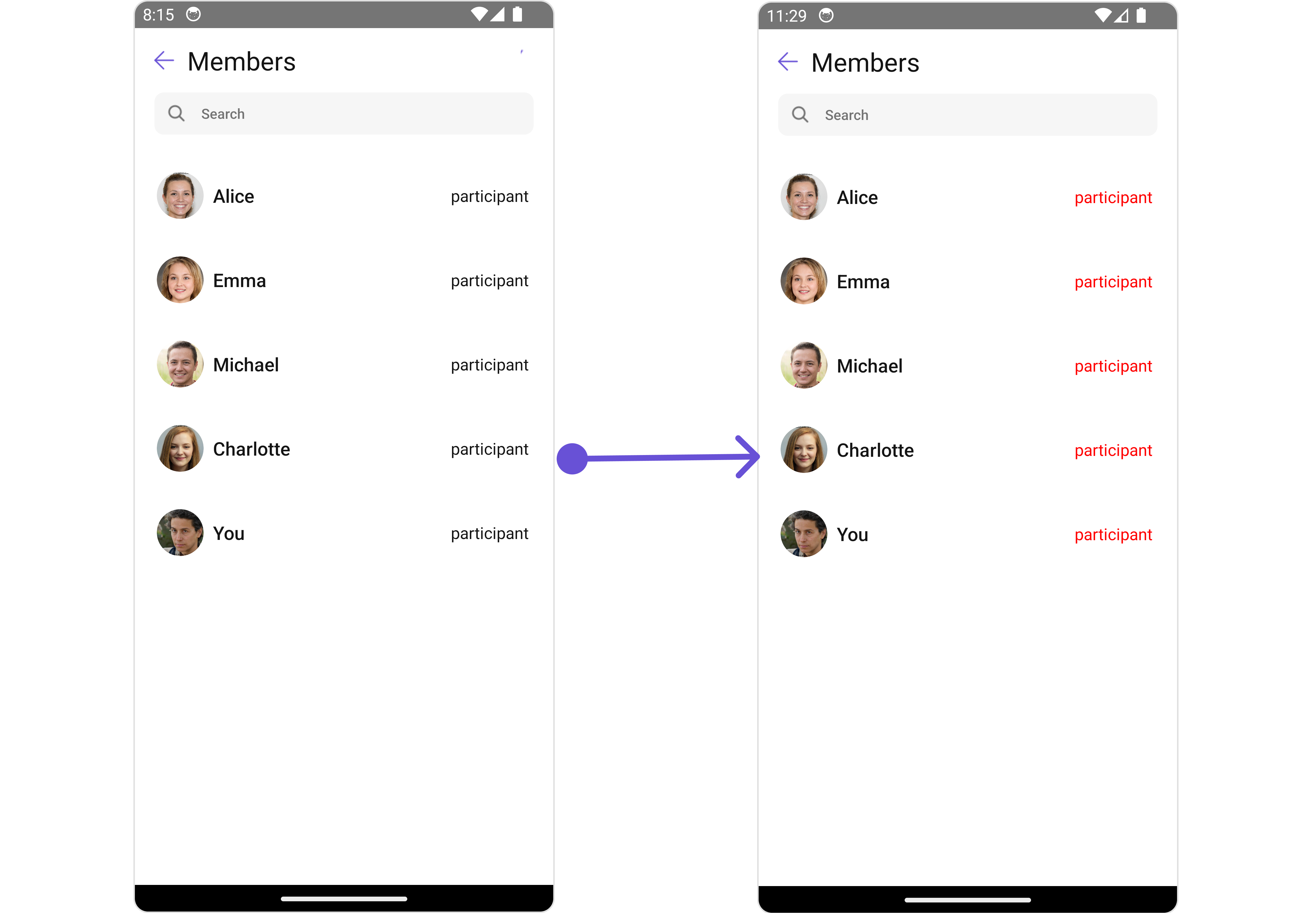
2. GroupScope Style
You can set theGroupScope to the Group Members Component to customize the styling.
- iOS
- Android
- App.tsx
3. Avatar Style
To apply customized styles to theAvatar component in the Group Members Component, you can use the following code snippet. For further insights on Avatar Styles refer
- App.tsx
4. ListItem Style
To apply customized styles to theListItemStyle component in the Group Members Component, you can use the following code snippet. For further insights on ListItemStyle Styles refer
- App.tsx
5. StatusIndicator Style
To apply customized styles to the Status Indicator component in the Group Members Component, You can use the following code snippet. For further insights on Status Indicator Styles refer- App.tsx
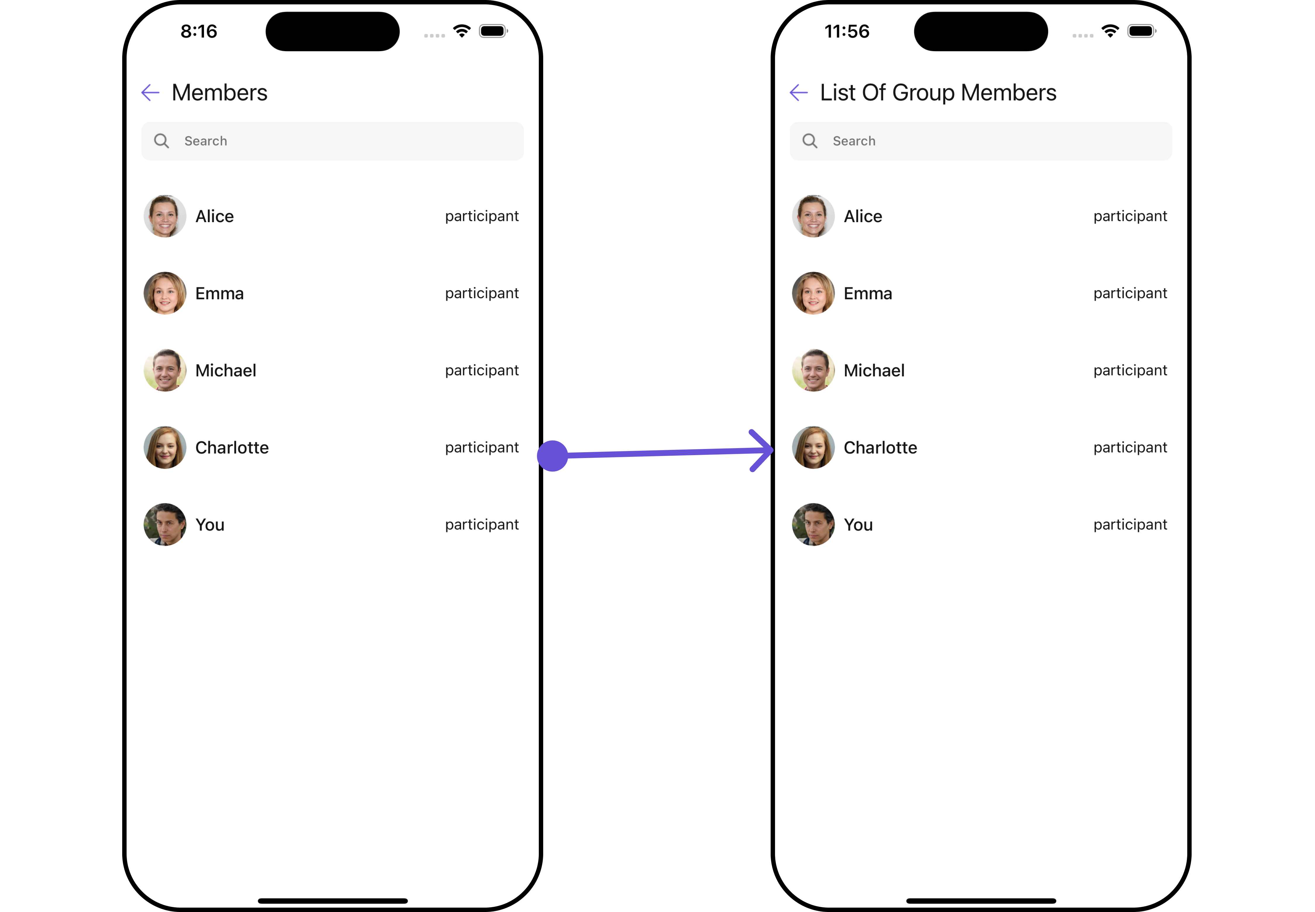
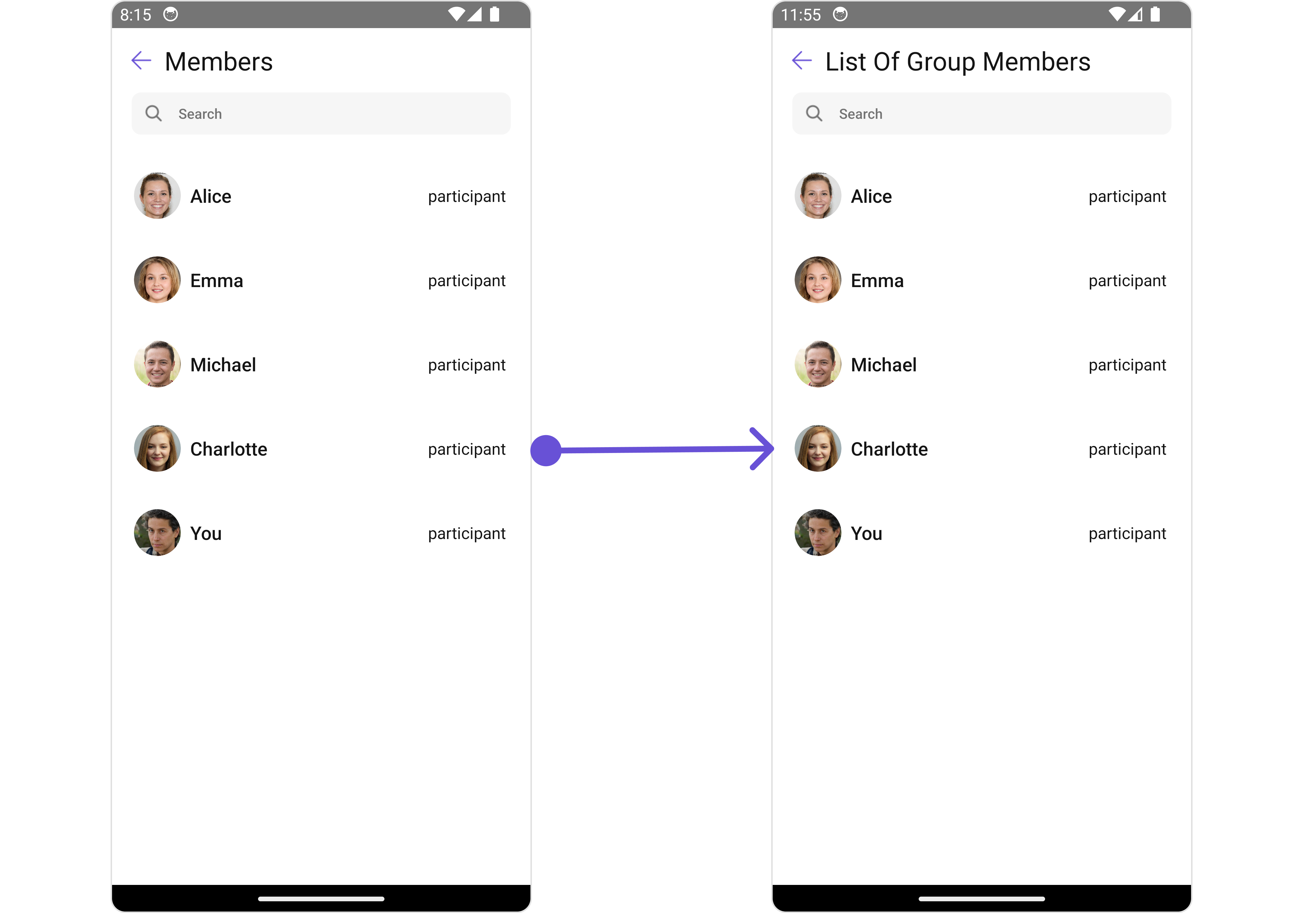
Functionality
These are a set of small functional customizations that allow you to fine-tune the overall experience of the component. With these, you can change text, set custom icons, and toggle the visibility of UI elements.- App.tsx
- iOS
- Android
Advance
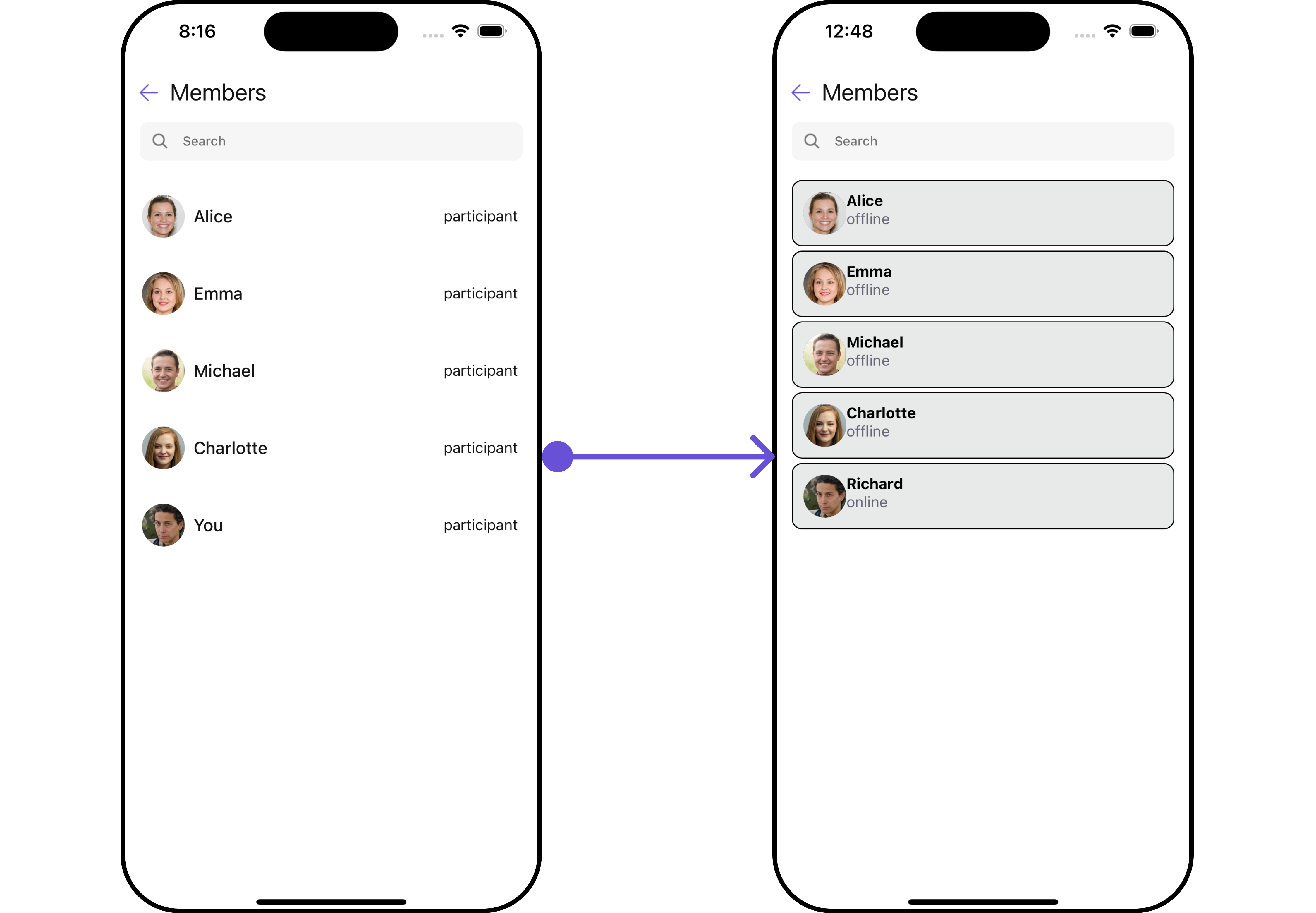
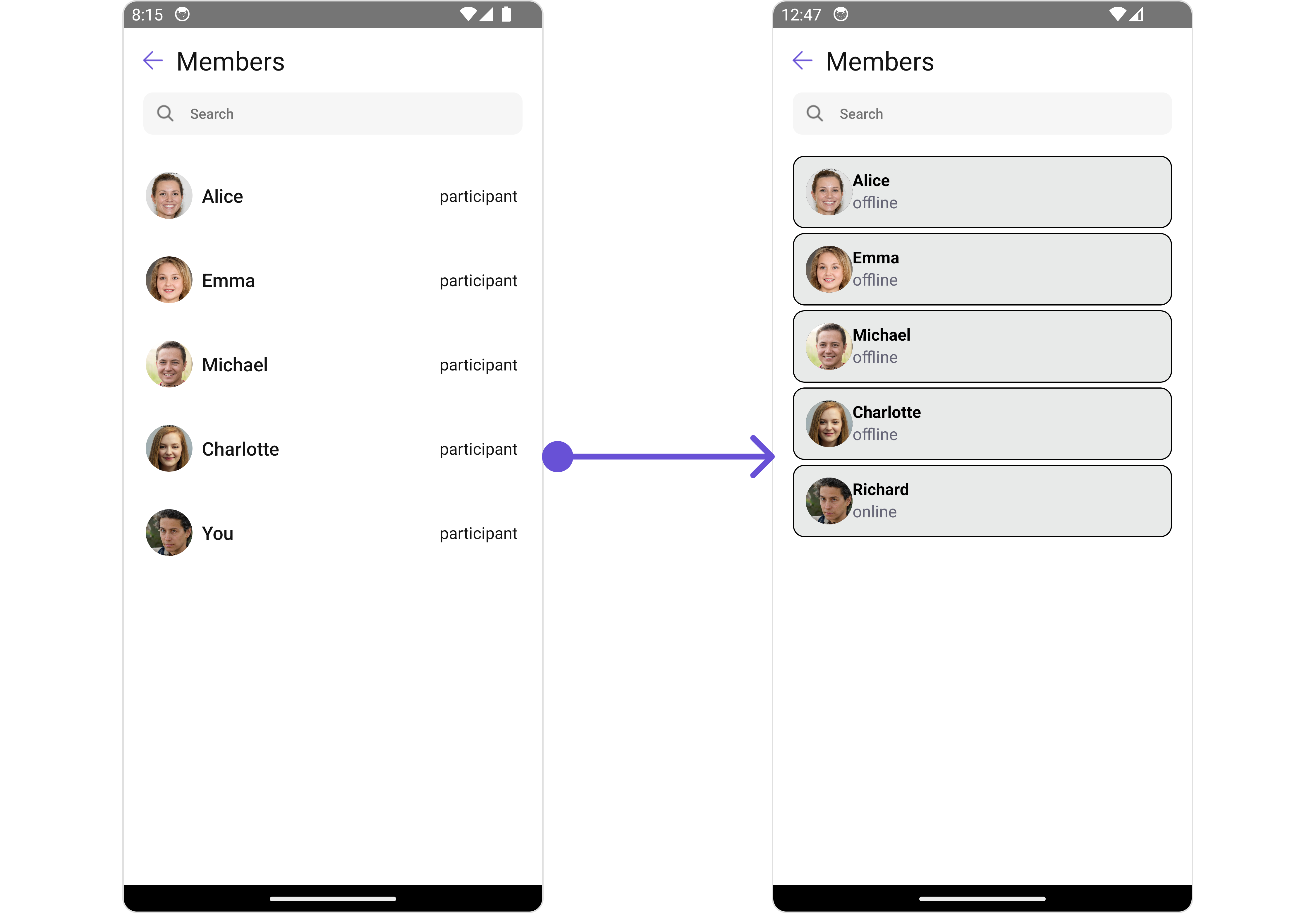
For advanced-level customization, you can set custom views to the component. This lets you tailor each aspect of the component to fit your exact needs and application aesthetics. You can create and define your views, layouts, and UI elements and then incorporate those into the component.ListItemView
With this property, you can assign a custom ListItem to the Group Members Component. Example- iOS
- Android
- App.tsx
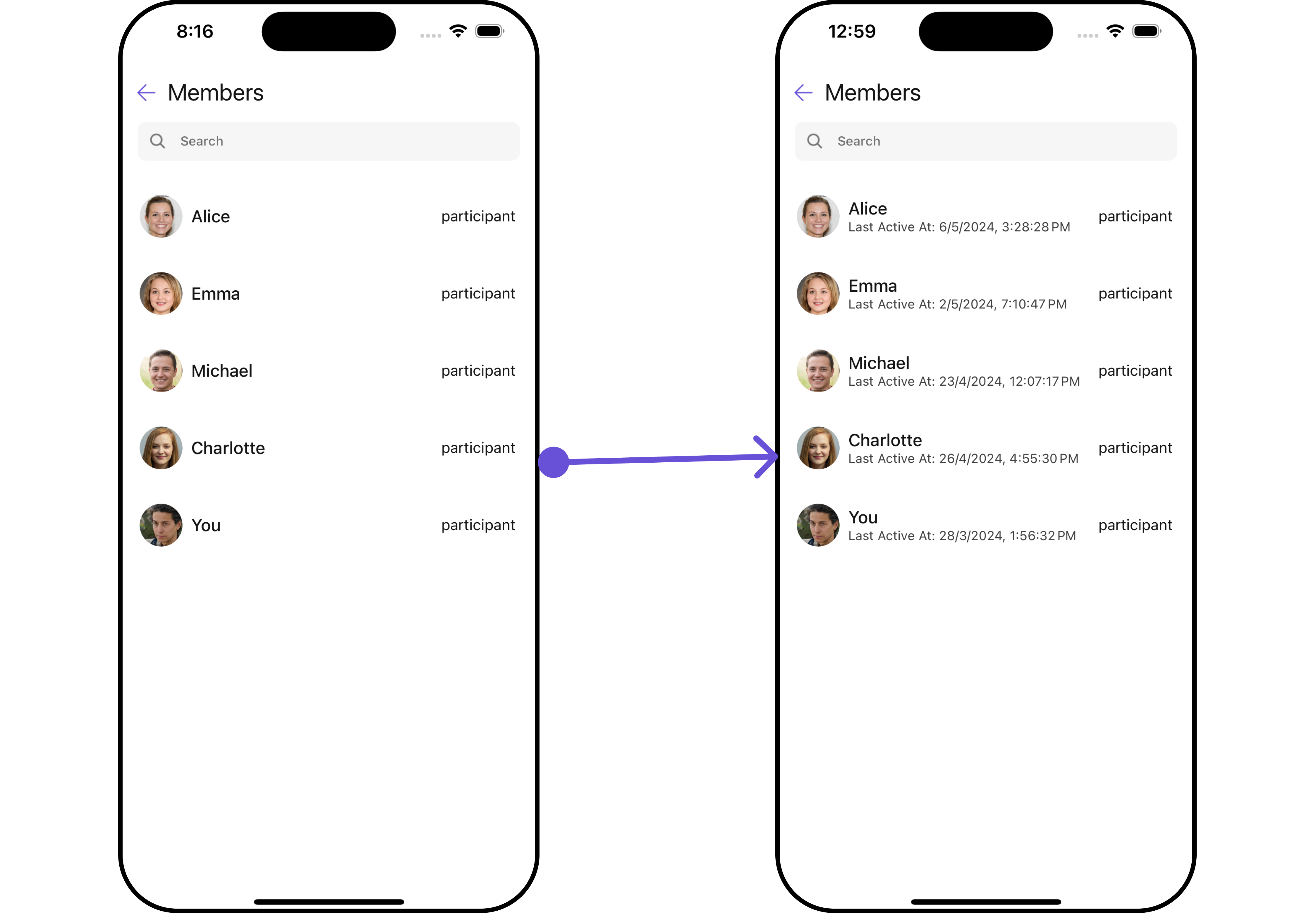
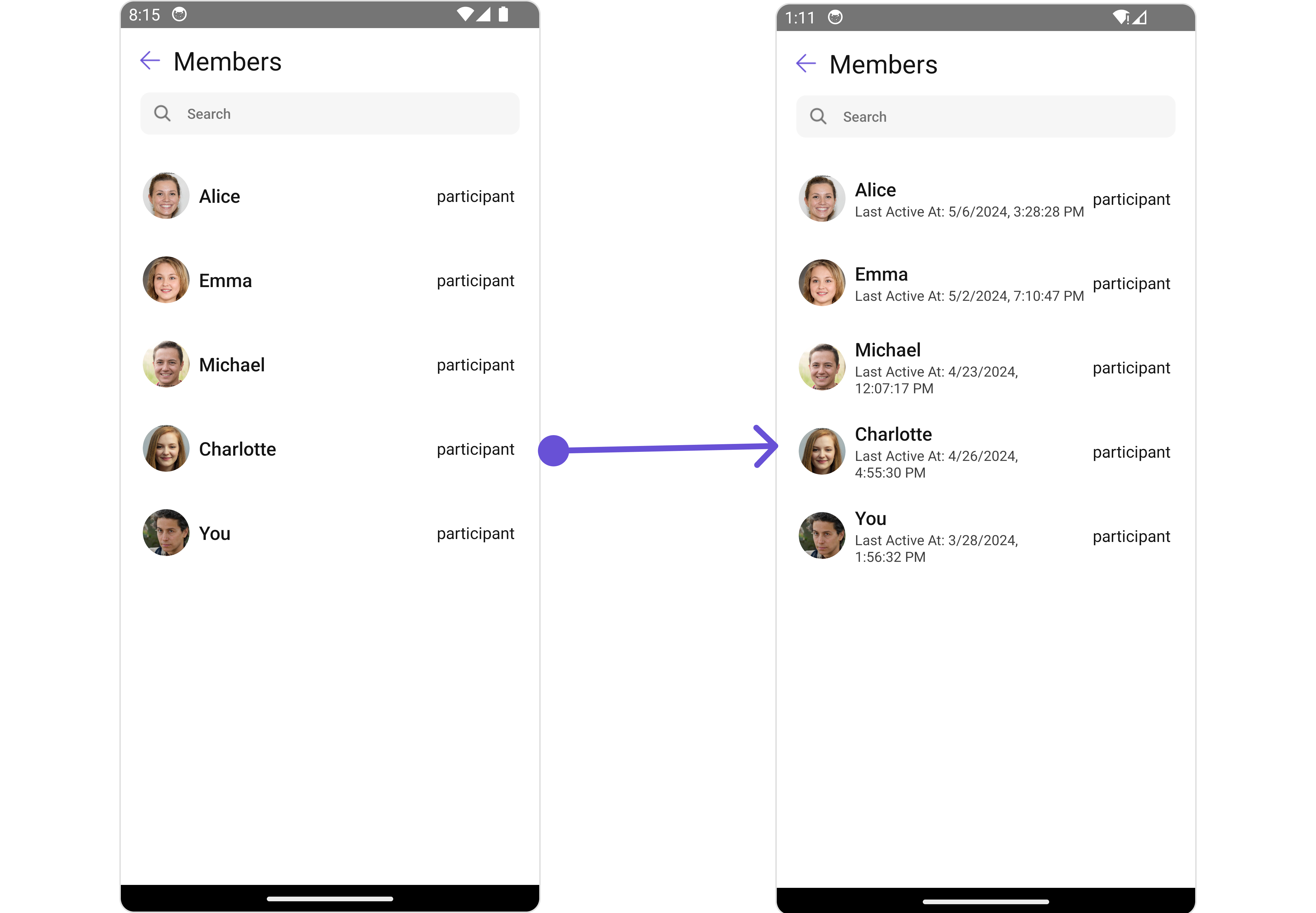
SubtitleView
You can customize the subtitle view for each group members to meet your requirements- iOS
- Android
- App.tsx
TailView
You can customize the tail view for each group members to meet your requirements- iOS
- Android
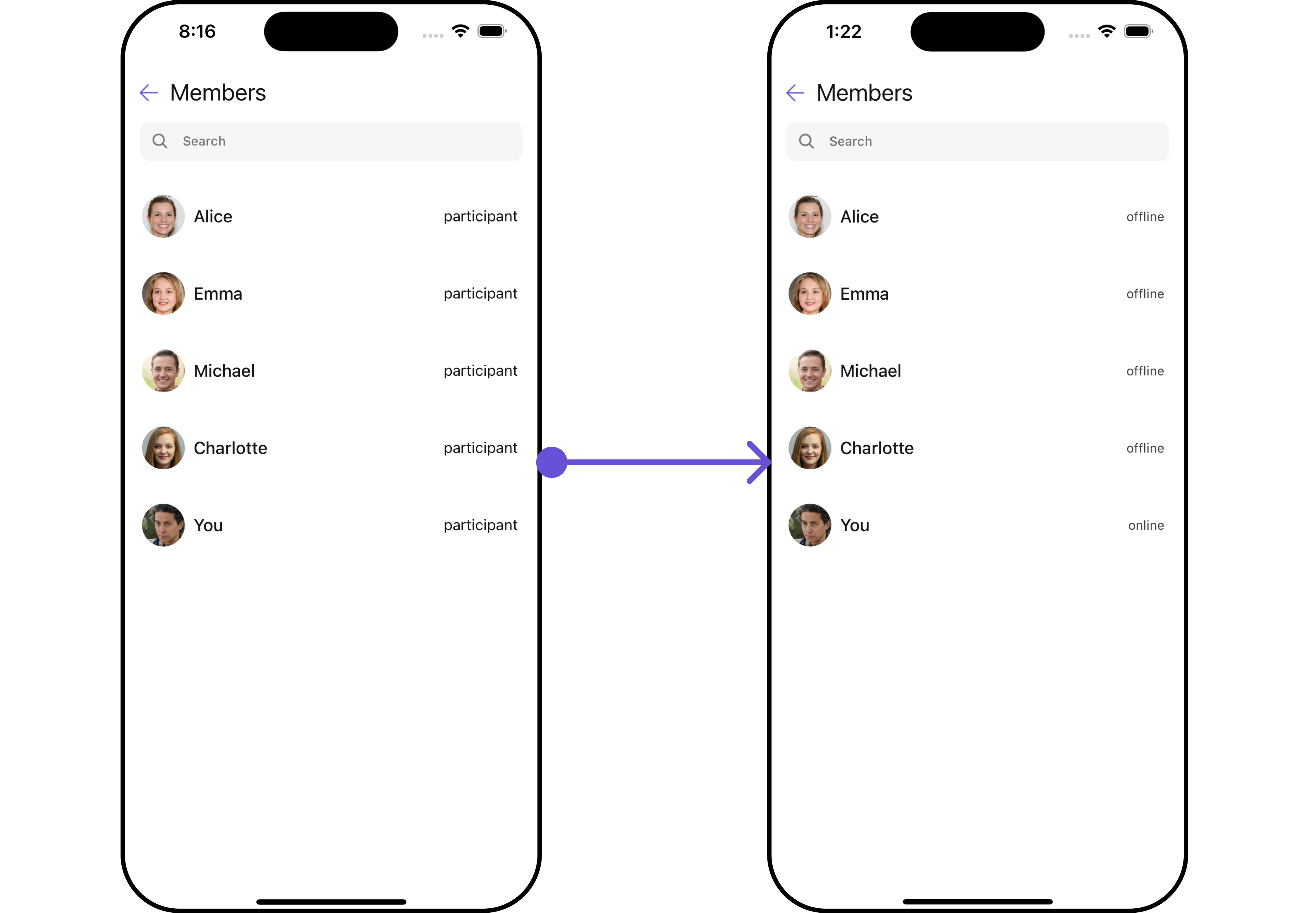
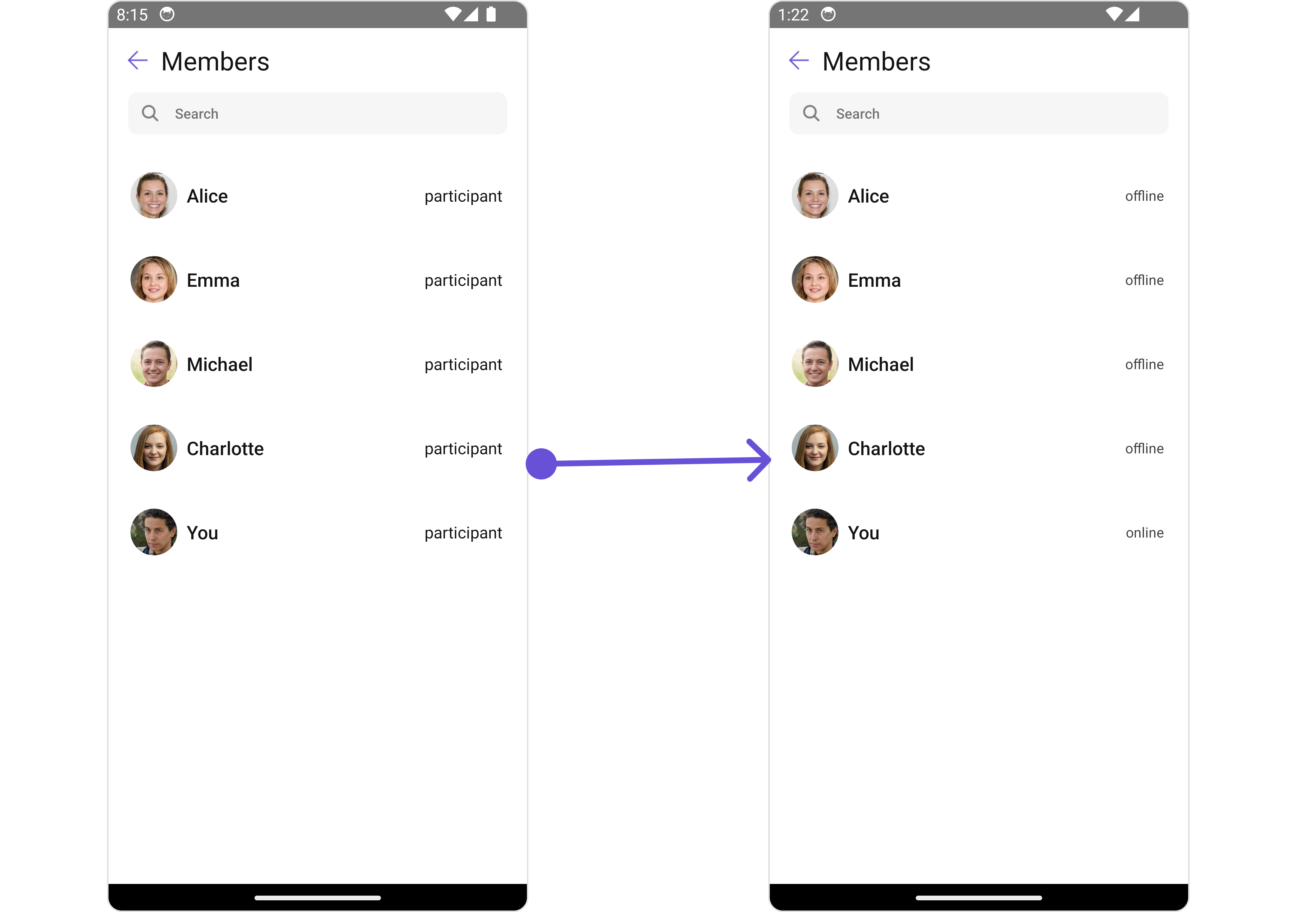
- App.tsx
EmptyStateView
You can set a customEmptyStateView using emptyStateView to match the empty view of your app.
- App.tsx
ErrorStateView
You can set a customErrorStateView using errorStateView to match the error view of your app.
- App.tsx
AppBarOptions
You can set the Custom Menu view to add more options to the Group Members component.- iOS
- Android
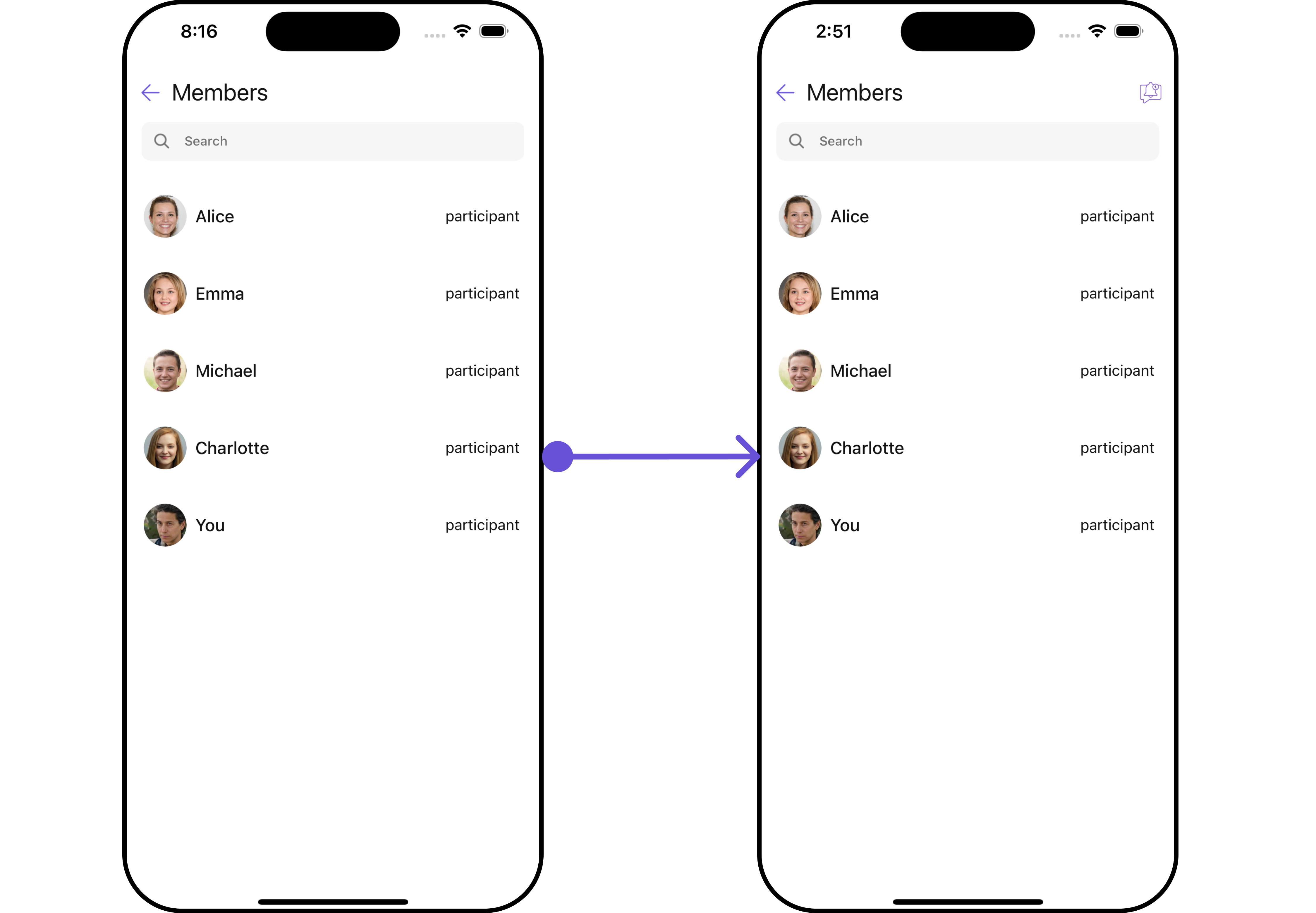
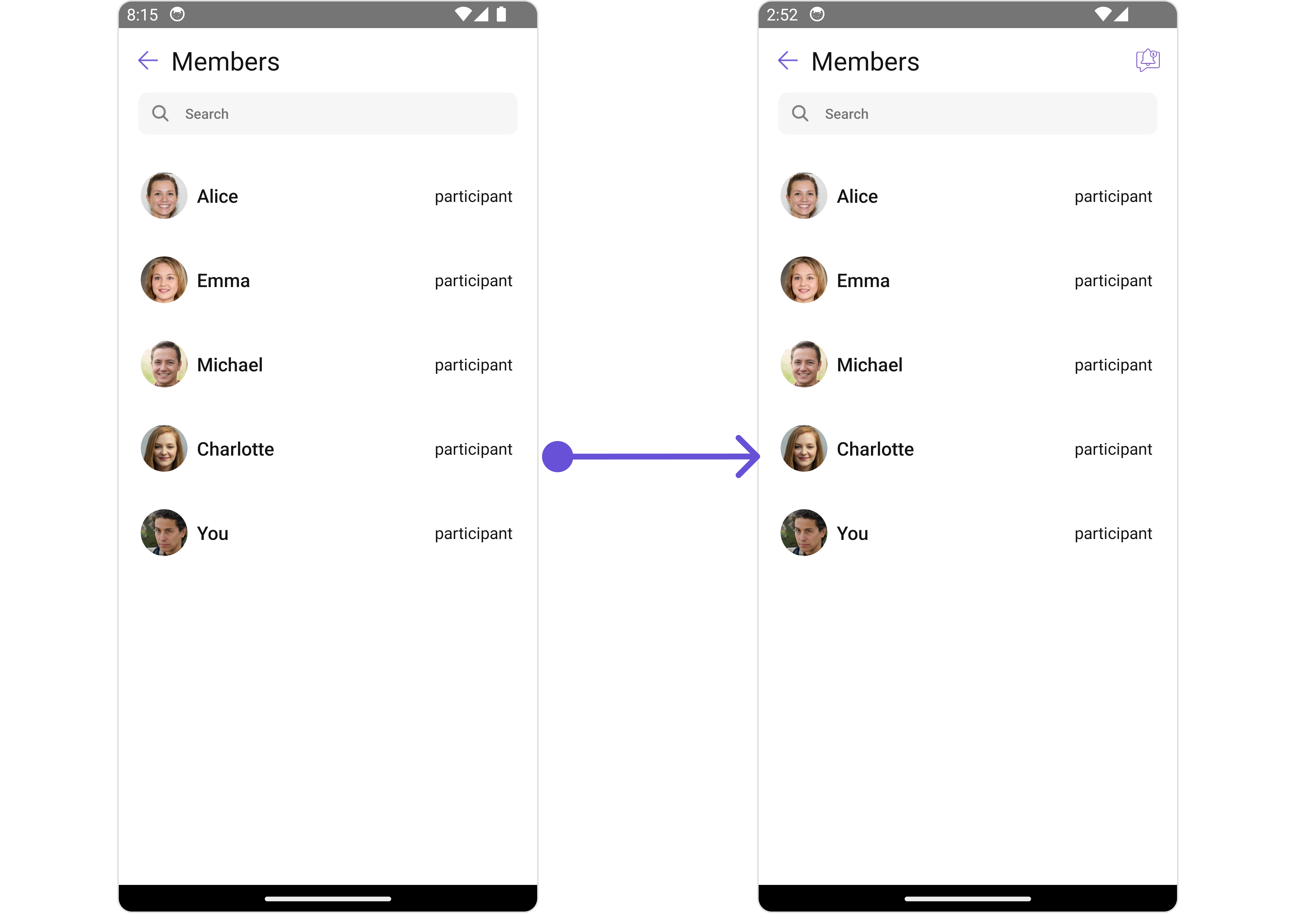
- App.tsx
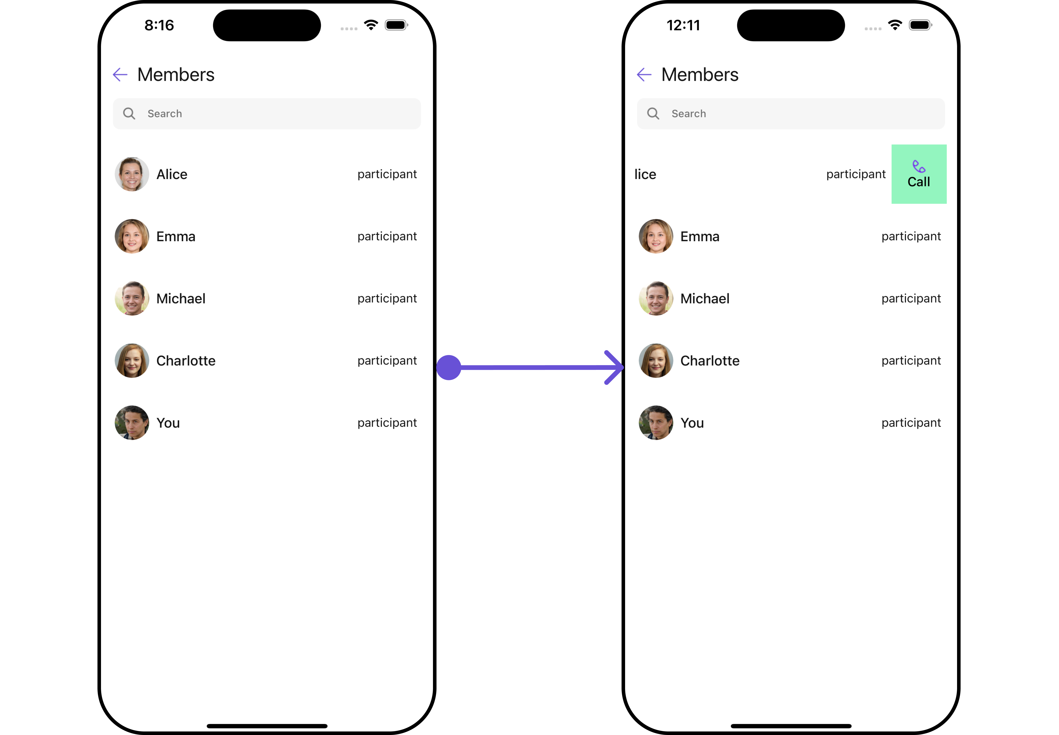
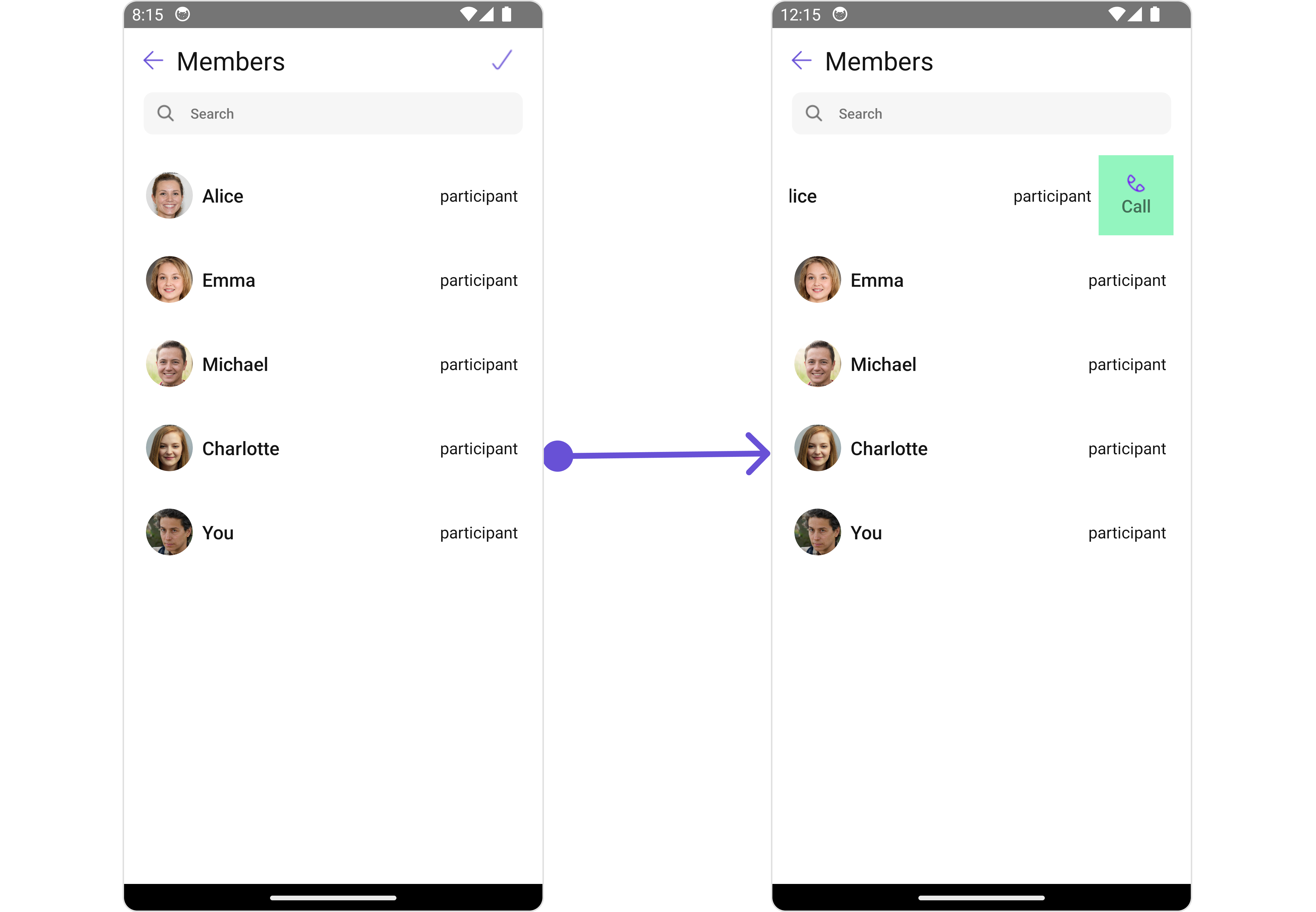
Swipe Options
You can set the Custom Swipe options to the Add Members component.- iOS
- Android
- App.tsx