

AI Integration Quick Reference
AI Integration Quick Reference
Where It Fits
CometChatMessageList is a message display component. It requires either a User or Group object to fetch and render messages. Wire it with CometChatMessageHeader and CometChatMessageComposer to build a complete messaging layout.
- Kotlin
- Java
ChatActivity.kt
Quick Start
Add the component to your layout XML:layout_activity.xml
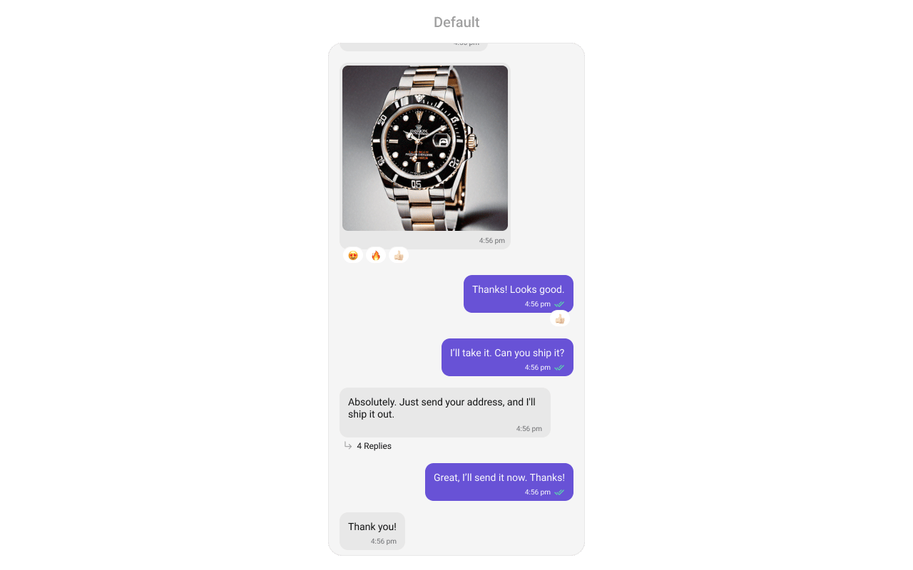
CometChatUIKit.init(), a user logged in, and the cometchat-chat-uikit-android dependency added.
Set a User or Group object in your Activity:
- Kotlin
- Java
YourActivity.kt
.setGroup(group) with a Group object instead of .setUser(user).
Filtering Messages
Pass aMessagesRequest.MessagesRequestBuilder to setMessagesRequestBuilder. Pass the builder instance — not the result of .build().
- Kotlin
- Java
Filter Recipes
The following parameters in
MessagesRequestBuilder will always be altered inside the message list:- UID
- GUID
- types
- categories
The component uses infinite scroll — older messages load as the user scrolls up. Refer to MessagesRequestBuilder for the full builder API.
Reactions Request Builder
UsesetReactionsRequestBuilder to customize how reactions are fetched:
- Kotlin
- Java
Actions and Events
Callback Methods
setOnThreadRepliesClick
Fires when a user taps a threaded message bubble. No predefined behavior.
- Kotlin
- Java
YourActivity.kt
What this does: Registers a callback that fires when a user taps a threaded message bubble. The callback receives thecontext, thebaseMessage, and thecometchatMessageTemplate.
setOnError
Fires on internal errors (network failure, auth issue, SDK exception).
- Kotlin
- Java
YourActivity.kt
What this does: Registers an error listener. If the component encounters an error (e.g., network failure), your callback receives the CometChatException.
setOnLoad
Fires when the list is successfully fetched and loaded.
- Kotlin
- Java
YourActivity.kt
What this does: Registers a callback that fires after the message list is fetched and rendered. The callback receives the list of loaded BaseMessage objects.
setOnEmpty
Fires when the list is empty, enabling custom handling such as showing a placeholder.
- Kotlin
- Java
YourActivity.kt
What this does: Registers a callback that fires when the message list has no items. Use this to show a custom empty-state message or trigger other logic.
setOnReactionClick
Fires when a reaction is tapped, enabling custom reaction interactions.
- Kotlin
- Java
YourActivity.kt
What this does: Replaces the default reaction-click behavior. When a user taps a reaction, your custom lambda executes with theemojiandbaseMessage.
setOnReactionLongClick
Fires when a user long-presses on a reaction pill.
- Kotlin
- Java
YourActivity.kt
What this does: Replaces the default reaction long-press behavior. When a user long-presses a reaction pill, your custom lambda executes with theemojiandbaseMessage.
setOnAddMoreReactionsClick
Fires when a user clicks the “Add More Reactions” button.
- Kotlin
- Java
YourActivity.kt
What this does: Replaces the default “Add More Reactions” button behavior. Your callback receives the baseMessage that the user wants to react to.
setOnReactionListItemClick
Fires when a reaction list item is clicked in CometChatReactionsList.
- Kotlin
- Java
YourActivity.kt
What this does: Replaces the default reaction list item click behavior. Your callback receives thereactionandmessageobjects.
- Verify: After setting an action callback, trigger the corresponding user interaction (thread reply tap, reaction click, reaction long-press) and confirm your custom logic executes instead of the default behavior.
Global UI Events
The MessageList component does not emit any global UI events of its own.SDK Events (Real-Time, Automatic)
The component listens to SDK message events internally. No manual attachment needed unless additional side effects are required.Automatic: new messages, edits, deletions, and reactions update the list in real time.
Functionality
Small functional customizations such as toggling visibility of UI elements, setting custom sounds, configuring alignment, and enabling AI features.- Kotlin
- Java
- Verify: After calling a visibility method, confirm the corresponding UI element is shown or hidden. After calling
disableSoundForMessages(true), confirm no sound plays on incoming messages.
Custom View Slots
Each slot replaces a section of the default UI.setHeaderView
Sets a custom header view displayed at the top of the message list.
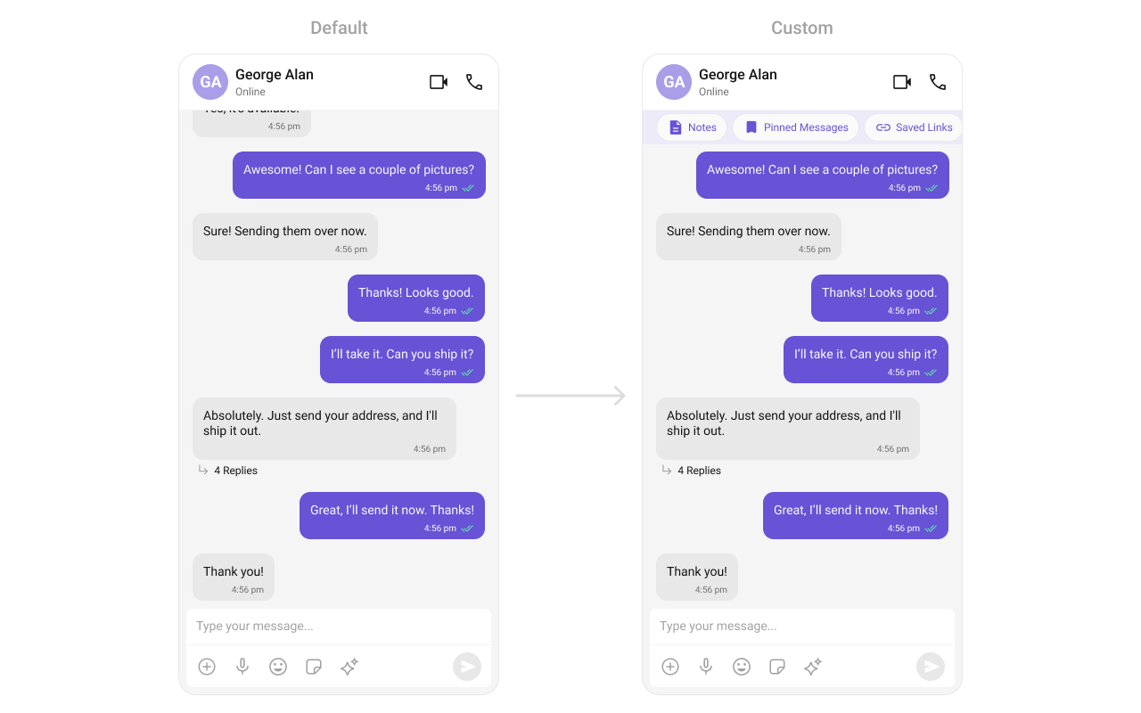
custom_header_layout.xml layout:
custom_header_layout.xml
What this does: Defines a custom header layout with three pill-shaped buttons: “Notes”, “Pinned Messages”, and “Saved Links”. Each button uses a MaterialCardView with an icon and label styled with the primary color.
- Kotlin
- Java
What this does: Inflates the custom_header_layout.xml and sets it as the header view of the message list. The three pill buttons display above the messages.
setFooterView
Sets a custom footer view displayed at the bottom of the message list.
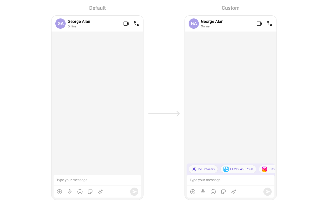
custom_footer_layout.xml
What this does: Defines a custom footer layout with three pill-shaped buttons: “Notes”, “Pinned Messages”, and “Saved Links”. Each button uses a MaterialCardView with an icon and label styled with the primary color.
- Kotlin
- Java
What this does: Inflates the custom_footer_layout.xml and sets it as the footer view of the message list. The three pill buttons display below the messages.
setLoadingStateView
Customizes the loading indicator when messages are being fetched.
- Kotlin
- Java
What this does: Replaces the default loading spinner with your custom layout resource. The custom view displays while messages are being fetched.
setEmptyStateView
Defines a custom view displayed when no messages are available.
- Kotlin
- Java
What this does: Replaces the default empty state with your custom layout resource. The custom view displays when the message list has no items.
setErrorStateView
Custom error state view displayed when fetching messages fails.
- Kotlin
- Java
What this does: Replaces the default error state with your custom layout resource. The custom view displays when the component encounters an error during message fetching.
setNewMessageIndicatorView
Replaces the default “new messages” indicator that appears when new messages arrive while the user has scrolled up.
- Kotlin
- Java
YourActivity.kt
What this does: Replaces the default new message indicator with a custom layout. The indicator appears when new messages arrive while the user is scrolled up in the message list.
setTemplates
CometChatMessageTemplate is a pre-defined structure for creating message views (message bubbles). For more information, refer to CometChatMessageTemplate.
setTextFormatters
Assigns the list of text formatters. If the provided list is not null, it sets the list. Otherwise, it assigns the default text formatters retrieved from the data source. To configure the existing Mentions look and feel check out MentionsFormatter Guide.
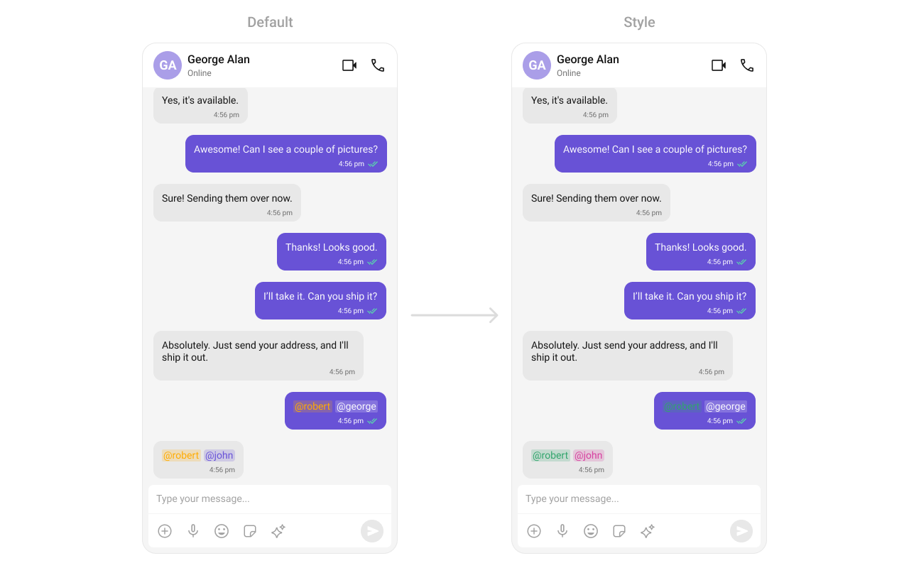
themes.xml
What this does: Defines custom mention styles for incoming and outgoing message bubbles. Incoming mentions appear in pink (#D6409F) and outgoing mentions appear in white (#FFFFFF), both with green self-mentions (#30A46C).
- Kotlin
- Java
What this does: Creates a CometChatMentionsFormatter, applies custom outgoing and incoming mention styles, adds it to a list of text formatters, and passes that list to the message list component. Mentions in message bubbles render with the custom colors.
setDateFormat
Specifies a custom format for displaying sticky date separators in the chat.
- Kotlin
- Java
What this does: Sets the sticky date separator format to “MMM dd, yyyy” (e.g., “Jul 10, 2024”) using the device’s default locale.
setTimeFormat
Defines the format in which time appears for each message bubble.
- Kotlin
- Java
What this does: Sets the message bubble time format to “hh:mm a” (e.g., “02:30 PM”) using the device’s default locale.
setDateTimeFormatter
Provides a custom implementation of DateTimeFormatterCallback to configure how time and date values are displayed. Each method corresponds to a specific case:
time(long timestamp)— Custom full timestamp formattoday(long timestamp)— Called when a message is from todayyesterday(long timestamp)— Called for yesterday’s messageslastWeek(long timestamp)— Messages from the past weekotherDays(long timestamp)— Older messagesminutes(long diffInMinutesFromNow, long timestamp)— e.g., “5 minutes ago”hours(long diffInHourFromNow, long timestamp)— e.g., “2 hours ago”
- Kotlin
- Java
What this does: Overrides the default date/time formatting for message timestamps. Today’s messages show “Today”, yesterday’s show “Yesterday”, recent messages show “X mins ago” or “X hrs ago”, last week’s show “Last Week”, and older messages show the full date in “dd MMM yyyy” format.
- Verify: After setting any custom view slot, confirm the custom view renders in the correct position within the message list, and the data binding populates correctly.
Common Patterns
Hide all chrome — minimal message list
- Kotlin
- Java
Hide all message action options
- Kotlin
- Java
Enable AI features
- Kotlin
- Java
Custom quick reactions
- Kotlin
- Java
Start from unread messages
- Kotlin
- Java
Advanced Methods
Scroll and Navigation
scrollToBottom
Programmatically scrolls to the bottom of the message list.
- Kotlin
- Java
scrollToMessageId
Scrolls to a specific message by its ID and highlights it.
- Kotlin
- Java
gotoMessage
Navigates to a specific message by ID.
- Kotlin
- Java
Message Manipulation
addMessage
Programmatically adds a message to the list.
- Kotlin
- Java
setList
Replaces the entire message list with a new list.
- Kotlin
- Java
updateMessage
Updates a message at a given index.
- Kotlin
- Java
Threaded Messages
setParentMessage
Sets the parent message ID for threaded message view.
- Kotlin
- Java
AI Features
generateConversationSummary
Triggers the generation of a conversation summary by fetching it from the ViewModel.
- Kotlin
- Java
setAIAssistantSuggestedMessages
Sets suggested messages for the AI assistant.
- Kotlin
- Java
setAiAssistantTools
Registers custom AI assistant tool call listeners.
- Kotlin
- Java
Bubble Margins
Internal Access
These methods provide direct access to internal components for advanced use cases.Use these only when the standard API is insufficient. Directly manipulating the adapter or ViewModel may conflict with the component’s internal state management.
Style
The component uses XML theme styles. Define a custom style with parentCometChatMessageListStyle in themes.xml, then apply with setStyle().
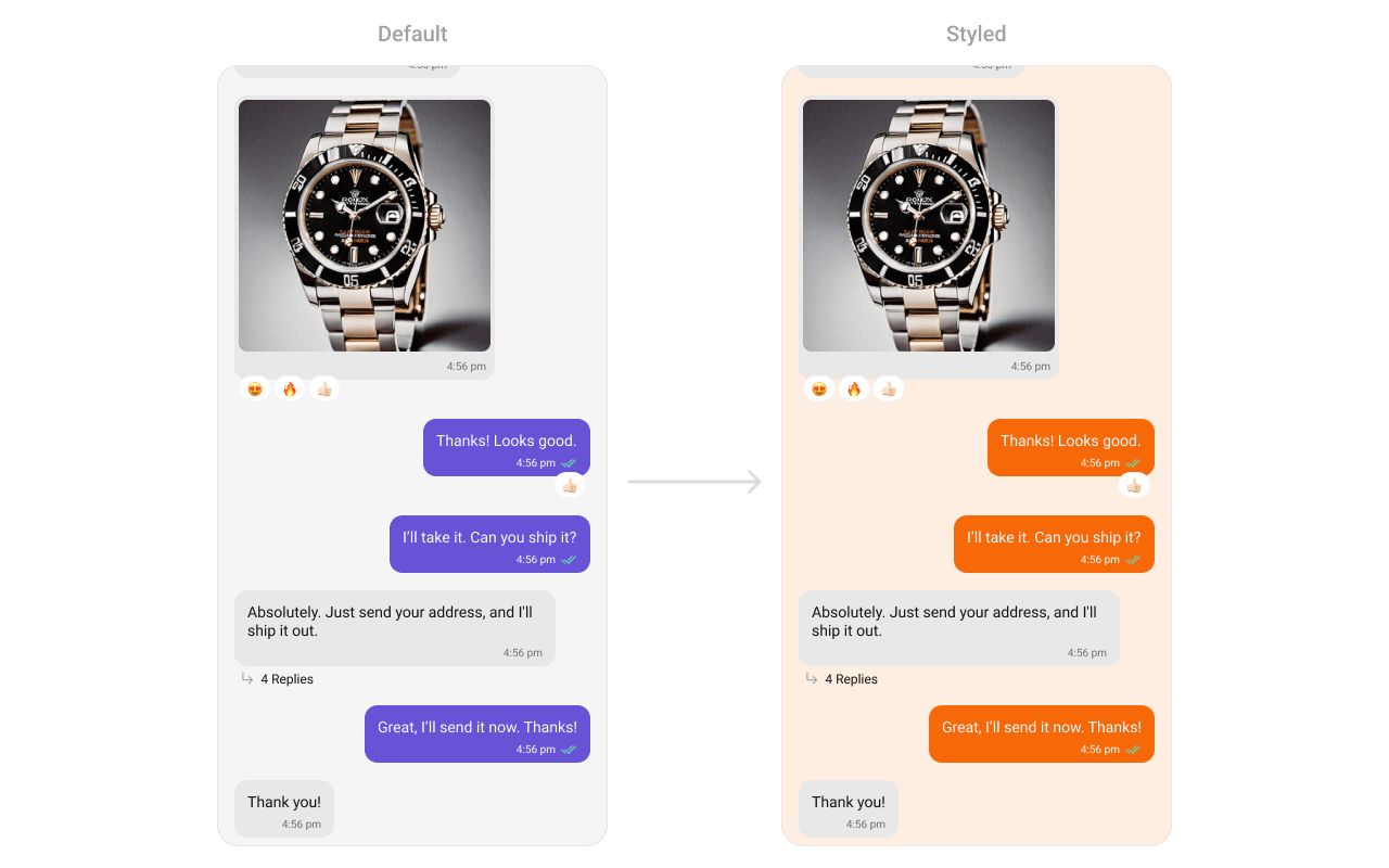
themes.xml
What this does: Defines two custom styles:CustomOutgoingMessageBubbleStylesets the outgoing message bubble background to orange (#F76808);CustomCometChatMessageListStylesets the message list background to light peach (#FEEDE1) and applies the custom outgoing bubble style.
- Kotlin
- Java
Programmatic Style Properties
In addition to XML theme styles, the component exposes programmatic setters for fine-grained control:Customization Matrix
Next Steps
Message Header
Display user/group info in the toolbar
Message Composer
Rich input for sending messages
Conversations
Browse recent conversations
Theming
Customize colors, fonts, and styles