

AI Integration Quick Reference
AI Integration Quick Reference
When to use this
- You want a single UI Kit theme that matches your app branding.
- You need light and dark mode support with consistent colors.
- You want to customize primary, background, or text colors across UI Kit.
- You want a different UI Kit theme for a specific activity.
Prerequisites
- CometChat UI Kit for Android is installed and initialized.
- You can edit
app/src/main/res/values/themes.xml. - You can edit
AndroidManifest.xml. - Optional: You can create
app/src/main/res/values-night/themes.xmlfor dark mode overrides.
Quick start
1
Create or update your theme
File:
app/src/main/res/values/themes.xml. Extend CometChatTheme.DayNight as the base theme.2
Apply the theme to the app
File:
AndroidManifest.xml. Set android:theme on the <application> element.3
Optional: Apply a theme to a specific activity
File:
AndroidManifest.xml. Set android:theme on a specific <activity> if needed.4
Override key theme attributes
File:
app/src/main/res/values/themes.xml. Update cometchatPrimaryColor and other attributes.5
Optional: Add dark mode overrides
File:
app/src/main/res/values-night/themes.xml. Override attributes for dark mode.6
Build and verify
Run the app and confirm UI Kit screens use your colors in light and dark mode.
Core concepts
CometChatTheme.DayNight: Base UI Kit theme built onTheme.MaterialComponents.DayNight.NoActionBar.- Theme attributes:
cometchatPrimaryColor,cometchatBackgroundColor1,cometchatTextColorPrimary, and others. values-night: Android resource folder for dark mode overrides.
Theming Contract
Inputs- Base theme:
CometChatTheme.DayNightas the parent of your app theme - Global theme attributes in
app/src/main/res/values/themes.xml - Activity-scoped theme via
android:themeon a specific<activity>inAndroidManifest.xml - Optional dark mode overrides in
app/src/main/res/values-night/themes.xml
- Activity-level theme (most specific)
- Application-level theme (
android:themeon<application>) CometChatTheme.DayNightdefaults (least specific)
cometchatPrimaryColorchanges buttons, highlights, and interactive elementscometchatBackgroundColor1/cometchatBackgroundColor2change panel and surface backgroundscometchatTextColorPrimary/cometchatTextColorSecondarychange text across the UIcometchatStrokeColorDefaultchanges borders and dividers- Dark mode values from
values-nightapply automatically when the system uses night mode
Implementation
Create an app theme that extends CometChatTheme.DayNight
What you’re changing: The base theme used by UI Kit components.
- Where to change it:
app/src/main/res/values/themes.xml. - Applies to: All UI Kit components.
- Default behavior: UI Kit uses
CometChatTheme.DayNight. - Override: Define your app theme and set
parent="CometChatTheme.DayNight". - Code:
themes.xml
- What this does: Creates an app theme that inherits all UI Kit styling.
- Verify: UI Kit screens render correctly after the theme is applied.
Apply the theme to your application
What you’re changing: The theme applied to the entire app.-
Where to change it:
AndroidManifest.xml. - Applies to: All activities unless overridden.
- Default behavior: The application theme is not set to your UI Kit theme.
-
Override: Set
android:themeon the<application>element. - Code:
AndroidManifest.xml
-
What this does: Applies
AppThemeto every activity by default. - Verify: Launch any UI Kit screen and confirm the theme is applied.
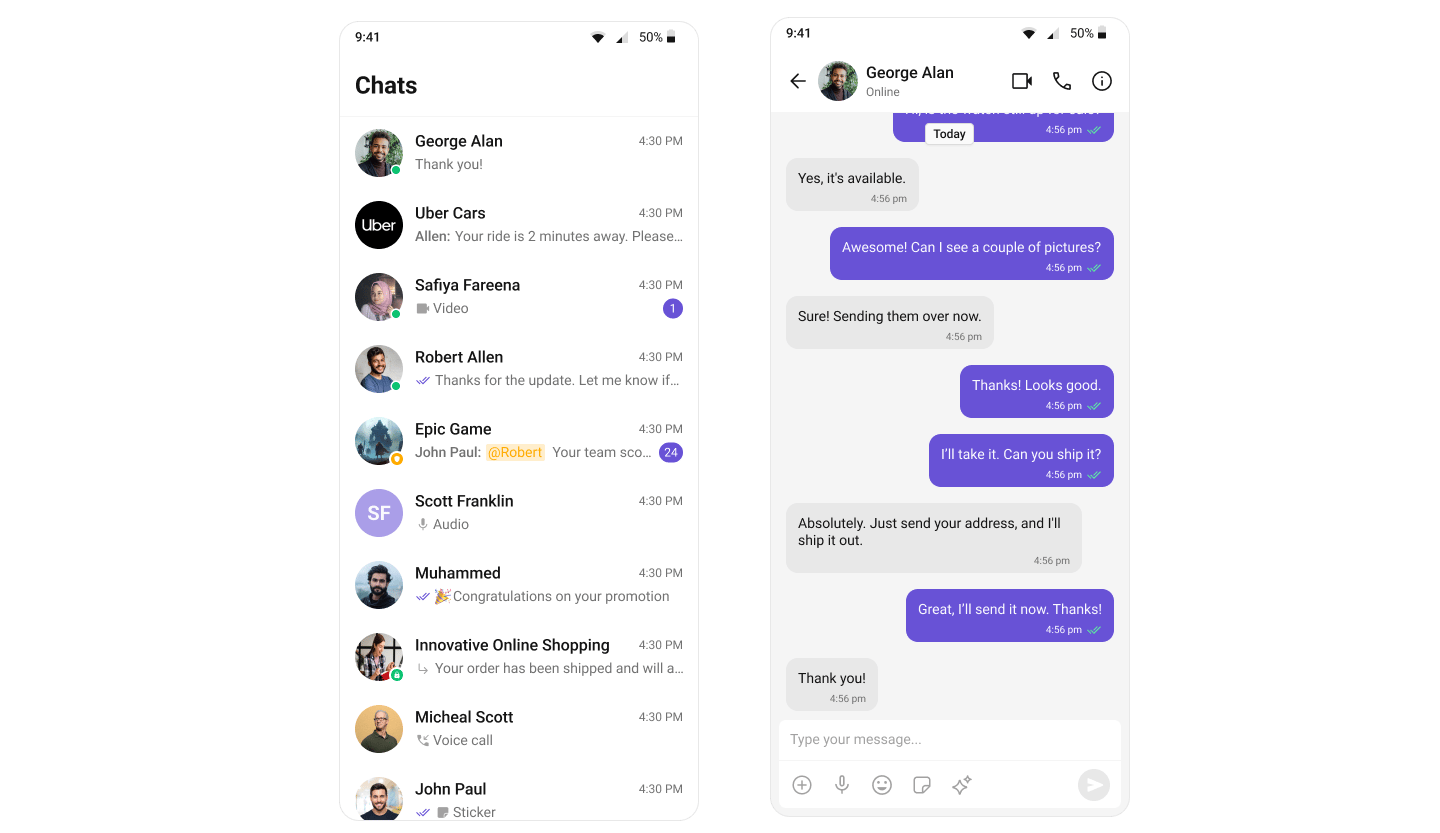
Apply a theme to a specific activity
What you’re changing: The theme for a single activity.-
Where to change it:
AndroidManifest.xml. - Applies to: Only the targeted activity.
- Default behavior: Activities inherit the application theme.
-
Override: Set
android:themeon the<activity>element. - Code:
AndroidManifest.xml
-
What this does: Applies
ChatThemeonly toChatActivity. -
Verify: Open
ChatActivityand confirm the theme differs from the rest of the app.
Change the primary color
What you’re changing: The primary brand color used across UI Kit.-
Where to change it:
app/src/main/res/values/themes.xml. - Applies to: Buttons, highlights, and interactive elements.
- Default behavior: UI Kit uses the default primary color.
-
Override: Set
cometchatPrimaryColorin your theme. - Code:
themes.xml
- What this does: Replaces the UI Kit primary color with your brand color.
- Verify: Buttons and highlights use the new color.
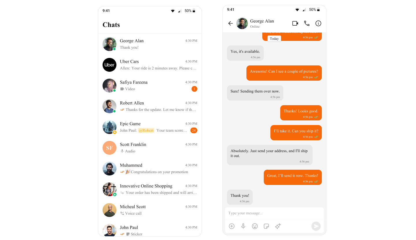
Customize common theme attributes
What you’re changing: Background, text, and stroke colors.-
Where to change it:
app/src/main/res/values/themes.xml. - Applies to: All UI Kit components that use these attributes.
- Default behavior: UI Kit uses its default theme values.
- Override: Define the attributes in your app theme.
- Code:
themes.xml
- What this does: Updates common UI Kit colors in one place.
- Verify: Backgrounds, text, and dividers reflect the new values.
Add dark mode overrides
What you’re changing: Theme values used in dark mode.-
Where to change it:
app/src/main/res/values-night/themes.xml. - Applies to: Dark mode only.
- Default behavior: Dark mode uses the same values as light mode.
-
Override: Create
values-night/themes.xmland override the attributes. - Code:
values-night/themes.xml
- What this does: Applies dark mode colors when the system uses night mode.
- Verify: Toggle dark mode on the device and confirm UI Kit colors update.
For a complete list of theme attributes, visit the theme attributes file on GitHub.