

Architecture
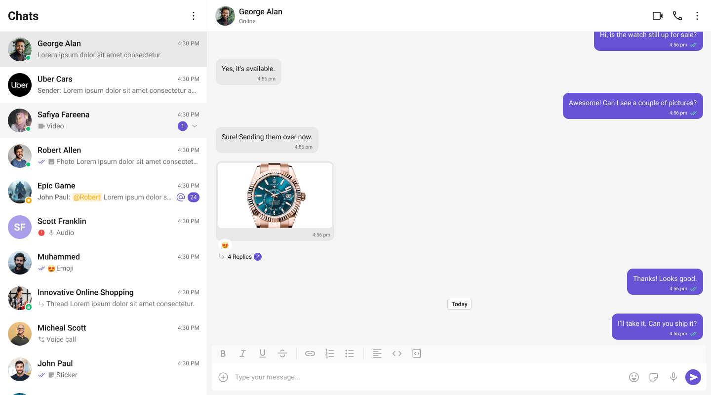
The UI Kit provides a set of independent, composable React components that wire together into complete chat layouts. A typical two-panel layout uses four core components:- CometChatConversations — sidebar listing recent conversations
- CometChatMessageHeader — toolbar showing avatar, name, status, and typing indicator
- CometChatMessageList — scrollable message feed with reactions, receipts, and threads
- CometChatMessageComposer — rich text input with attachments, mentions, and voice notes
CometChat.User or CometChat.Group object. Pass that object as a prop (user or group) to the message components. They handle SDK calls internally — the composer sends messages, the list receives them via real-time listeners.
All components must be rendered inside a <CometChatProvider> which provides shared context (theme, locale, events). SDK initialization and login must be completed before the provider mounts.
Flat API
All components — both feature and base — support the flat API. Render them in a single line with props, and they handle their layout internally.Compound Composition
For full layout control, use the compound pattern. Each feature component is a namespace with sub-components:- Root initializes state, fetches data, and provides context to children.
- Sub-components read from context and render when their state is active.
- Omit a sub-component to hide it, no boolean props needed.
- Add custom elements anywhere inside Root alongside the sub-components.
Component Categories
Components are organized into three categories:Feature Components
Feature components integrate with the CometChat SDK for data fetching, real-time events, and state management. They follow the compound pattern and support both flat and compound APIs. Feature components:- Own their data lifecycle (fetch, paginate, refresh)
- Subscribe to real-time SDK events (new messages, presence changes, typing indicators)
- Manage complex state via hooks and reducers
- Provide context to their sub-components
Base Components
Base components are pure UI building blocks with no SDK integration. They accept props and render UI — no network calls, no real-time events. Feature components compose these internally. Base components support both flat API and compound composition.Feature Components
All feature components are imported from@cometchat/chat-uikit-react.
Conversations and Lists
Messages
Message Bubbles
Message bubble components accept amessage object and self-extract all required data (text, attachments, metadata, sender info). Unlike v6 where bubbles were purely presentational, v7 bubbles are self-contained — they derive their rendering state directly from the SDK message.
Calling
Search and AI
Base Components
Base components are imported from@cometchat/chat-uikit-react. They don’t have individual doc pages — use the source types and Storybook for reference.
Component API Pattern
All components share a consistent API surface for customization.Actions (Callbacks)
Callback props fire on user interactions. Override them to customize behavior:Filters (RequestBuilder)
List components acceptRequestBuilder props to control which data loads:
.build().
View Props
View props replace the visual content inside a component slot while keeping the default behavior wired:CSS Styling
Components use CSS custom properties (design tokens). Override them on the.cometchat root or on component-specific selectors:
.cometchat-component-name__element--modifier.
Next Steps
Theming
Customize colors, fonts, and spacing with CSS variables
Plugins
Customize message rendering with the plugin system
Event System
Subscribe to real-time events across components
Guides
Task-oriented tutorials for common patterns