

AI Integration Quick Reference
AI Integration Quick Reference
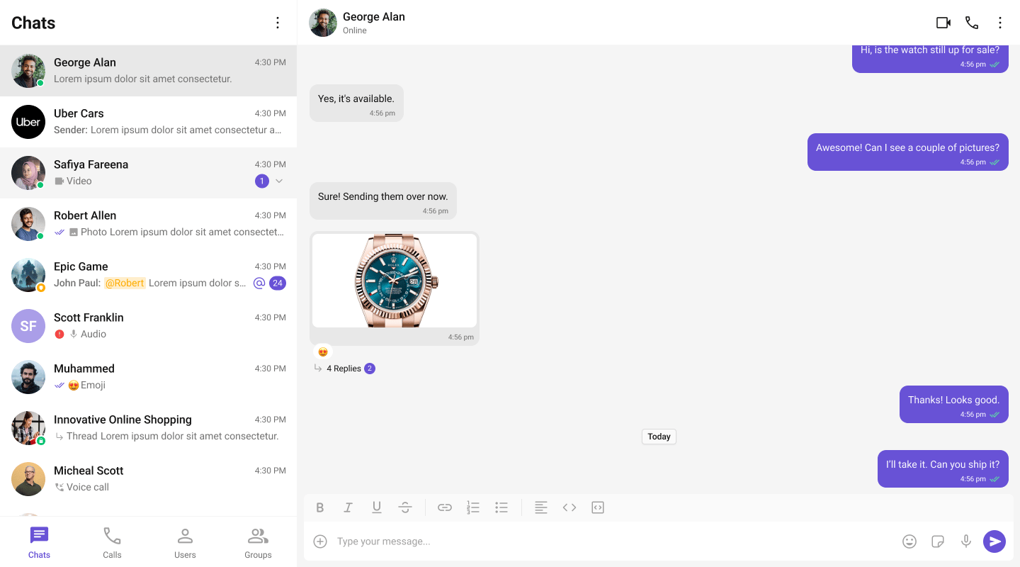
What You’re Building
Three sections working together:- Tab bar — switches between Chat, Calls, and Users
- Sidebar — renders the list for the active tab
- Message view — header + messages + composer for the selected item
Full Code
Create the client component with the tabbed UI, then import it dynamically in your page. Init and login happen in auseEffect before the provider mounts.
app/chat/CometChatClient.tsx
app/chat/chat.css
app/chat/page.tsx
How It Works
'use client'marks the component as a Client Component — required because CometChat uses browser APIs.dynamic(() => import(...), { ssr: false })prevents the component from rendering on the server.- Tab state —
activeTabcontrols which list component renders in the sidebar. - Conditional rendering — only the active tab’s component mounts. Switching tabs unmounts the previous list and mounts the new one.
- Unified selection — all three tabs feed into the same
selectedUser/selectedGroupstate. Clicking any item (conversation, call log, or user) updates the message panel. - Call log handling — when a call log is clicked, the receiver (user or group) is extracted and passed to the message components.
Adding More Tabs
To add a Groups tab, importCometChatGroups and add another tab button + conditional render:
Run
http://localhost:3000/chat. You should see the tab bar at the top of the sidebar. Switch between Chats, Calls, and Users — clicking any item loads the message view on the right.
Next Steps
Conversation List + Messages
Two-panel layout without tabs
Components Overview
Browse all prebuilt UI components
Theming
Customize colors, fonts, and styles